1953 Topps Mickey Mantle #82
1 / 2
Click to enlarge
💬
Reviews & Discussions
6 total reviews

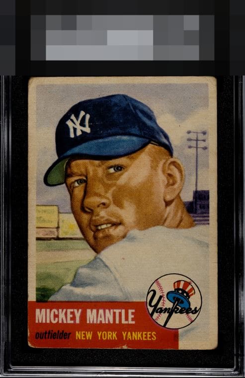
No need to highlight the obvious flaws. Instead I’ll call out the top notch centering and elite color.

The centering is too good with no problems on his face for me to go below B+. High eye appeal thanks to that centering.

I like the overall look of the card. The border size and centering are respectable. The main image is solid. The chipping/white in the Bottom Red box both the corner and centered below the York catches my eye and distracts me. The card is better than the slab but the bottom holds it back

Punches well above its weight. Centering is 'A' eye appeal level and the central image holds the eye. Corner wear and the chip in the bottom center edge are the detracting factors.

5 of 7 reviews
1 review
EyeQ+
--
Global Population
42
POPULATION ACROSS ALL GRADES AND GRADING COMPANIES
Global Eye Rank
—
No Eye Q+ score
Population in Grade
4
POPULATION IN THIS GRADE ACROSS ALL GRADING COMPANIES
Eye Rank in Grade
—
No Eye Q+ score
EYEQ+ TROPHY CASE

GLOBAL

IN-GRADE
Trophies appear here when earned.
📊
Rating Distribution
6 total reviews
G
0%
A+
0%
A
0%
A-
1 rating
20%
1
B+
3 ratings
60%
3
B
1 rating
20%
1
B-
0%
C+
0%
C
0%
C-
0%
D+
0%
D
0%
D-
0%
F
0%
Eye appeal is detected despite the presence of significant corner wear and damage to the red regions of this Mantle. Centering, image, and surface are to thank for this phenomenon.