1953 Topps Mickey Mantle #82

Reviews & Discussions
11 total reviews


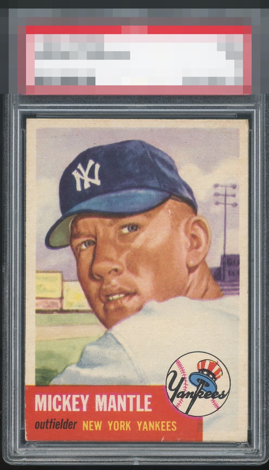
This is a high A- and minor improvement from a solid A. Overall it makes a great impression.

Very strong example of this card. Some chipping in the red, a mark on his head, and right-leaning centering are the minor flaws that just keep it from the top tier.

This reminds me of my copy. Great centering and registration to me, just a bit of a distraction on the left corner for me. Great eye appeal IMO.

Very nice framing for this difficult card. A little wear and chipping on the edges but great copy overall.

This is a strong copy. There are three flaws I do notice, and were there only two of these, this card would have an A or higher. There is the left red corner, which is the least impactful. The nick under the team name and a slight rightward and northward centering shift are the two main issues. Yet the sum is not substantial enough to dislodge the eye appeal from top tier for me.

Really nice one, great centering and decent surface. Some chipping in the red at the bottom border affects the grade.

This is a great looking card and you need to Nit Pick to find flaws(white spot on right side of face and chipping on the bottom of the red box) Normally these issue might stand out but this card has centering, has strong vibrant image, and amazing colors. This card should be with Collectors and not investors. But either way it is a Wow Card

Very well-centered. Colors and image are on point. A bit of wear on the bottom edge where the red is and small white speck on the side of the face are the main issues.
EyeQ+
EYEQ+ TROPHY CASE


Rating Distribution
11 total reviews
EyeBot detects a human handful of flaws that in sum make a minimal dent in eye appeal.