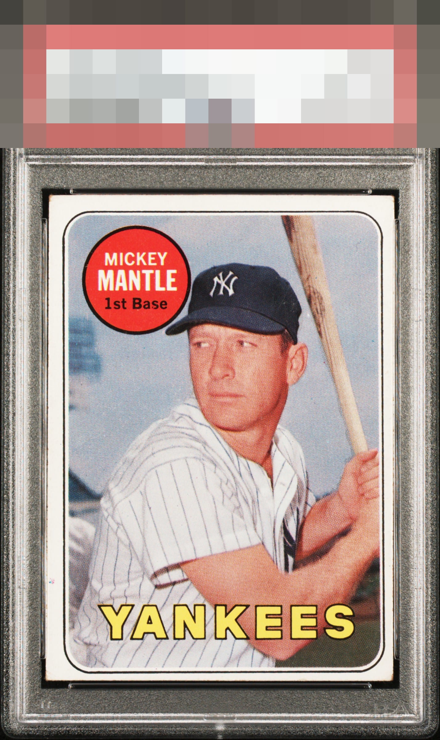
1969 Topps Mickey Mantle #500

Reviews & Discussions
6 total reviews

A little thin bottom border with side to side shift noticed but a great card of the Yankee legend.

centering/framing is off more than i like but the image and colors are solid and the Red really stands out. There is wear that holds it back from the next level

Very nice image and color. Surface looks clean and free of any major blemishes. Centering is the main detraction.

A+ image and red name circle. I love when the red is free of PD, and when his hat and the logo are bold and focused. Centering obviously nudges the eye. What's interesting to me as I stare at this card is the image holds my attention such that I don't notice the corners or lower left border blemish much. Eye appeal thus lands in the good zone. I know this card very well, and finding any specimen with second or first tier eye appeal is a collecting feat. Still searching at this end!

EyeQ+
EYEQ+ TROPHY CASE


Rating Distribution
6 total reviews
The only flaw here to me is centering, and the eye appeal is good thanks to a great image with no other problems but the framing. Corners here don't distract me.