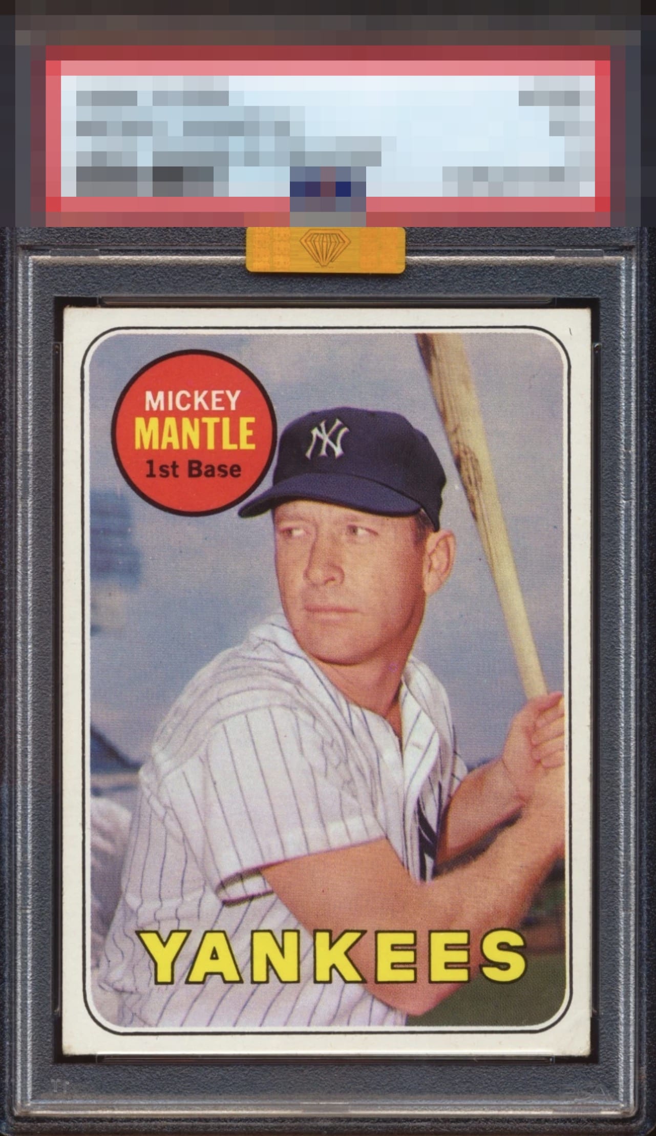
1969 Topps Mickey Mantle #500

Reviews & Discussions
12 total reviews

Looks like a well deserved sticker. So tough to find centered like this. Tip touched corners are the last thing you notice


Wow, how rare is this centering on this card? This is really nice and softness at the extreme endpoints is all I notice.

My kind of card, plain and simple. Are there flaws? Yes. Do they impact eye appeal? For me, not really. Only enough to go from GT to A+.


This is the best centering I have seen on this card and no flaws ruin the fun.

Centering is very good with a slight tilt. Corner wear and a little edge chipping are the only issues.

Great looking card with really nice centering, coloring, and image. Holding it back from greatness is that the card borders could be brighter and the corner wear

Very nicely centered. Love the colors and image. Subtle tilt is the main issue.
EyeQ+

EYEQ+ TROPHY CASE


Rating Distribution
12 total reviews
The centering is essentially spot on, but what really stands out is the color. Not only the image of the Mick, but the red and yellow on this copy really pop. The bottom corners are the only thing that holds it back from an even higher grade.