1966 Topps Mickey Mantle #50
1 / 2
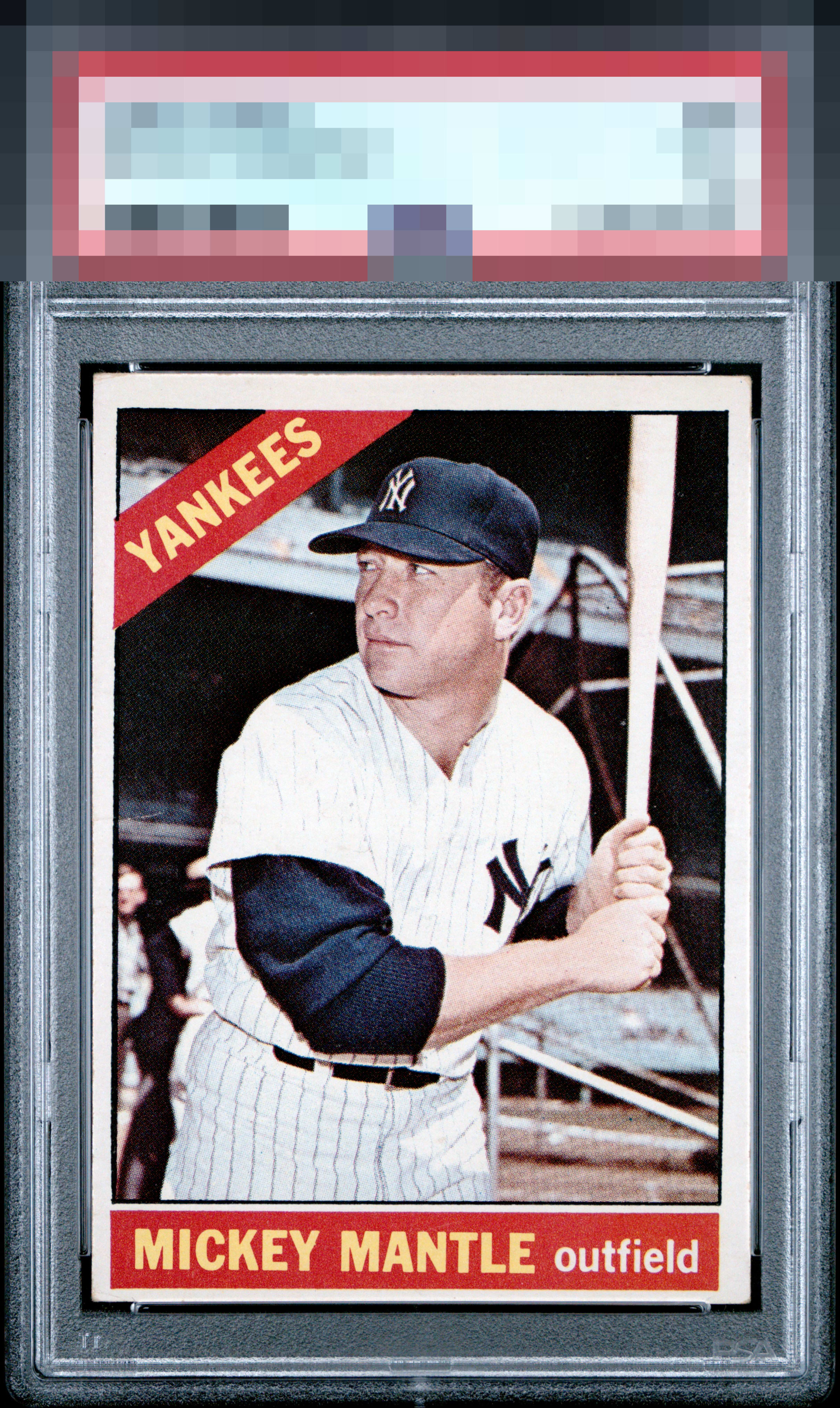
Click to enlarge
💬
Reviews & Discussions
4 total reviews

nice and clean and bright appeals to me but the mis sized borders and off centering holds it back

Below average centering distracts the eye initially. The image is clear with honest corner wear. The colored areas and lettering are free of any significant print flaws which uplifts the eye appeal of an overall pretty card of the Comet.

Love the crisp image; this is the level of focus that's ideal on the 66 Mick. Comparing examples reveals just how common a sub-optimally focused image is on this card. Centering keeps the overall eye appeal in the good tier, everything else is top notch. Shout out to the clean red name plate, another oft-plagued area of this card.

4 of 7 reviews

0 reviews
EyeQ+
--
Global Population
15
POPULATION ACROSS ALL GRADES AND GRADING COMPANIES
Global Eye Rank
—
No Eye Q+ score
Population in Grade
2
POPULATION IN THIS GRADE ACROSS ALL GRADING COMPANIES
Eye Rank in Grade
—
No Eye Q+ score
EYEQ+ TROPHY CASE

GLOBAL

IN-GRADE
Trophies appear here when earned.
📊
Rating Distribution
4 total reviews
G
0%
A+
0%
A
0%
A-
0%
B+
1 rating
25%
1
B
2 ratings
50%
2
B-
0%
C+
0%
C
1 rating
25%
1
C-
0%
D+
0%
D
0%
D-
0%
F
0%
The image and color stand out. Too off-centered to get in the A tiers.