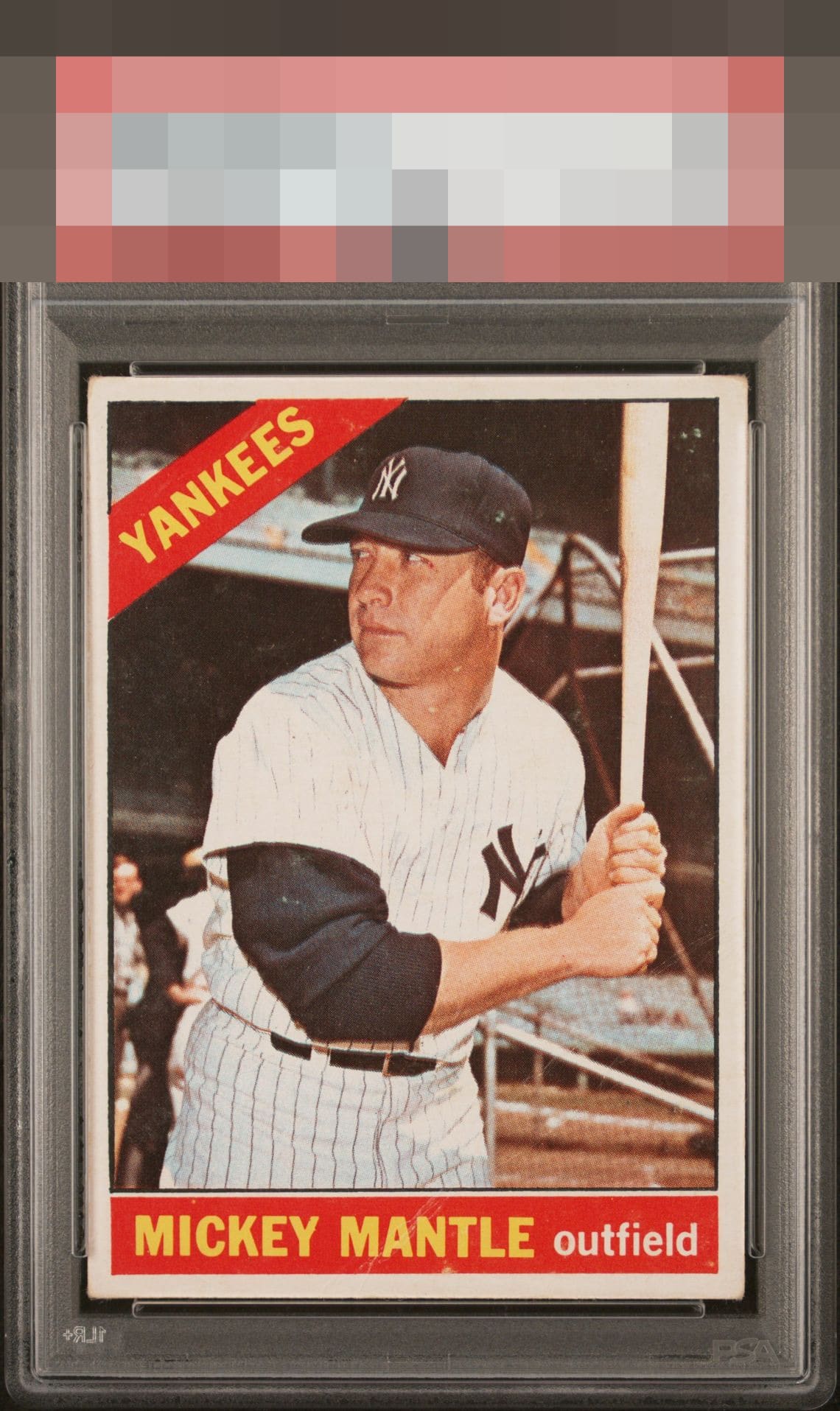
1966 Topps Mickey Mantle #50
1 / 2
Click to enlarge
💬
Reviews & Discussions
4 total reviews

Solid, good eye appeal with mild image blur (best seen when hitting compare in the card details page) that impacts eye appeal. The crease is subtle and serendipitously placed, with centering and corners that register but don't spoil the party.

minor toning and off centering hold it back but the image and colors work well and present well


4 of 7 reviews

0 reviews
EyeQ+
--
Global Population
15
POPULATION ACROSS ALL GRADES AND GRADING COMPANIES
Global Eye Rank
—
No Eye Q+ score
Population in Grade
1
POPULATION IN THIS GRADE ACROSS ALL GRADING COMPANIES
Eye Rank in Grade
—
No Eye Q+ score
EYEQ+ TROPHY CASE

GLOBAL

IN-GRADE
Trophies appear here when earned.
📊
Rating Distribution
4 total reviews
G
0%
A+
0%
A
0%
A-
0%
B+
0%
B
3 ratings
75%
3
B-
1 rating
25%
1
C+
0%
C
0%
C-
0%
D+
0%
D
0%
D-
0%
F
0%
Acceptable centering and honest corners on a well loved card that is easy on the eyes. Nice example.