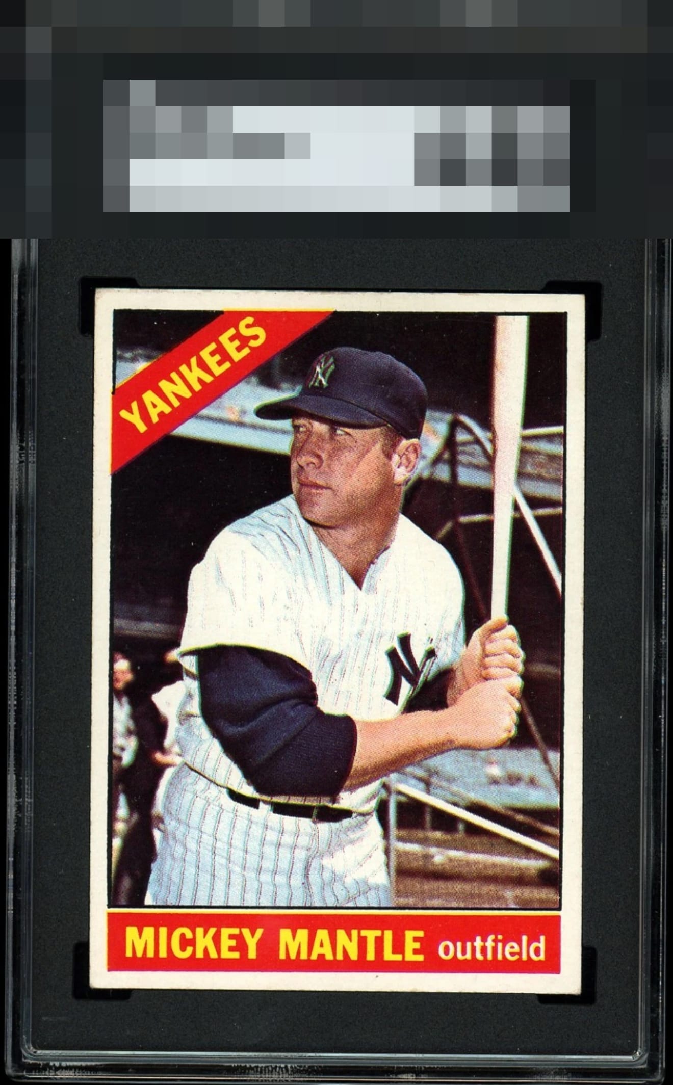
1966 Topps Mickey Mantle #50
1 / 2
💬
Reviews & Discussions
7 total reviews

Great copy. The bold color and nearly perfect registration jumps out. Just a bit of a tilt, which is my only real critique.

Comparing to others I love the clean background on this one and there is no PD. It is a little askew or angled in cut which keeps it at A- for me.


This is extreme top end centering for this card. No PD in the bottom red either. It is a touch out of focus if you compare examples.

very nice looking card with nice sized borders and clean borders. The borders/card has a slant causing centering and optics I am not a fan of. the colors and image are really sharp and nice to look at. minor surface wear but it mostly blends in I enjoy the card just not the optics

7 reviews

0 reviews
EyeQ+
--
Global Population
11
POPULATION ACROSS ALL GRADES AND GRADING COMPANIES
Global Eye Rank
—
No Eye Q+ score
Population in Grade
1
POPULATION IN THIS GRADE ACROSS ALL GRADING COMPANIES
Eye Rank in Grade
—
No Eye Q+ score
EYEQ+ TROPHY CASE

GLOBAL

IN-GRADE
Trophies appear here when earned.
📊
Rating Distribution
7 total reviews
G
0%
A+
0%
A
1 rating
14%
1
A-
5 ratings
71%
5
B+
0%
B
1 rating
14%
1
B-
0%
C+
0%
C
0%
C-
0%
D+
0%
D
0%
D-
0%
F
0%
Clean card with a nice image and color. Centering is good, but there is a tilt.