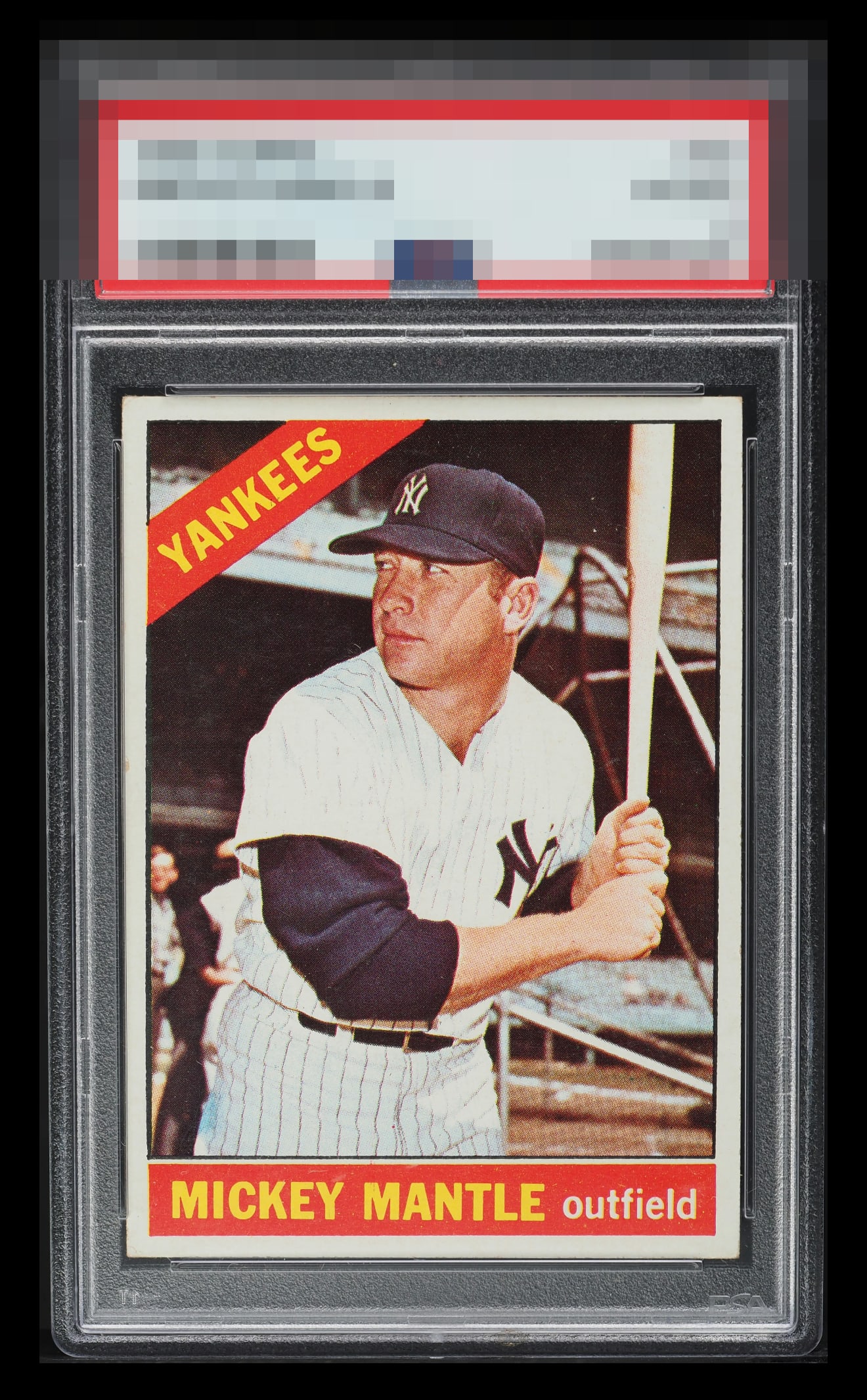
1966 Topps Mickey Mantle #50

Reviews & Discussions
11 total reviews

Some corner wear along with some surface issues and snow. Centering is great and color still pops through.

Speckles in the bottom red are the biggest issue. In other words, nice card.


Great centering. These 66t’s are tough. There’s just a few surface spots throughout, which hold it back for me. Still a very high nice presentation.

At first glance I read a bit of tilt but after closer examination it may be more of a diamond cut. In any event, the other attributes are very strong and bring this up a bit higher than I would normally go given the cut/tilt issue.

The overall impression outweighs the tilt/diamond cut which its is salient flaw. A great copy I would own in a heartbeat.

This copy presents with an impressively clean surface and vibrant visual balance. The contrast between the white borders and darker background gives the portrait real depth, while the red and yellow tones are well preserved and rich without oversaturation. The centering falls just short of ideal, yet it doesn’t distract from the card’s strong overall presentation. In sum, this example carries high eye appeal, offering a crisp, confident 66 Topps.

Looks like a nice card. The surface wear and the Diamond cut hold it back. The surface wear has issues in the Red box as well as 2 white spots between the hat and the bat. Overall the border sizes and centering is goof and the card is relatively clean and the image is good.

EyeQ+
EYEQ+ TROPHY CASE


Rating Distribution
11 total reviews
My supremely intelligent cycloptic eye is pleased. While mild flaws are detected, they do not cry out attention. If only humans could master such subtle harmony. I have placed this card on my list, for acquisition and safekeeping in the event of any future human/AI conflict. cc: Skynet.