1966 Topps Mickey Mantle #50
1 / 2
💬
Reviews & Discussions
4 total reviews

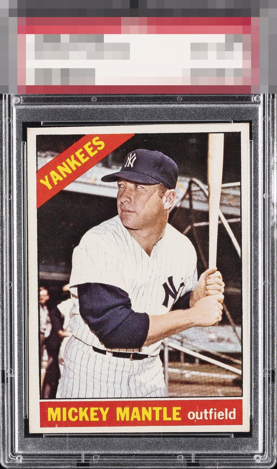
The centering and tilt is just too extreme for my taste, along with some PD in the nameplate rectangle.

Part of me thinks the tilt in the card is cool but to my eyes it holds back the overall eye appeal of the card. The borders are miz-sized, off centered and tilted and ruins the framing of the card. The image and the colors are really nice but I feel like i need to tilt the card to view it straight

The angled cut and tilt draws my eye. Good color and image but the issues hold it back.
4 reviews

0 reviews
EyeQ+
--
Global Population
9
POPULATION ACROSS ALL GRADES AND GRADING COMPANIES
Global Eye Rank
—
No Eye Q+ score
Population in Grade
2
POPULATION IN THIS GRADE ACROSS ALL GRADING COMPANIES
Eye Rank in Grade
—
No Eye Q+ score
EYEQ+ TROPHY CASE

GLOBAL

IN-GRADE
Trophies appear here when earned.
📊
Rating Distribution
4 total reviews
G
0%
A+
0%
A
0%
A-
0%
B+
0%
B
1 rating
25%
1
B-
1 rating
25%
1
C+
1 rating
25%
1
C
0%
C-
1 rating
25%
1
D+
0%
D
0%
D-
0%
F
0%
Tilt is a flaw that always bugs me. Very present to my eye on this one.