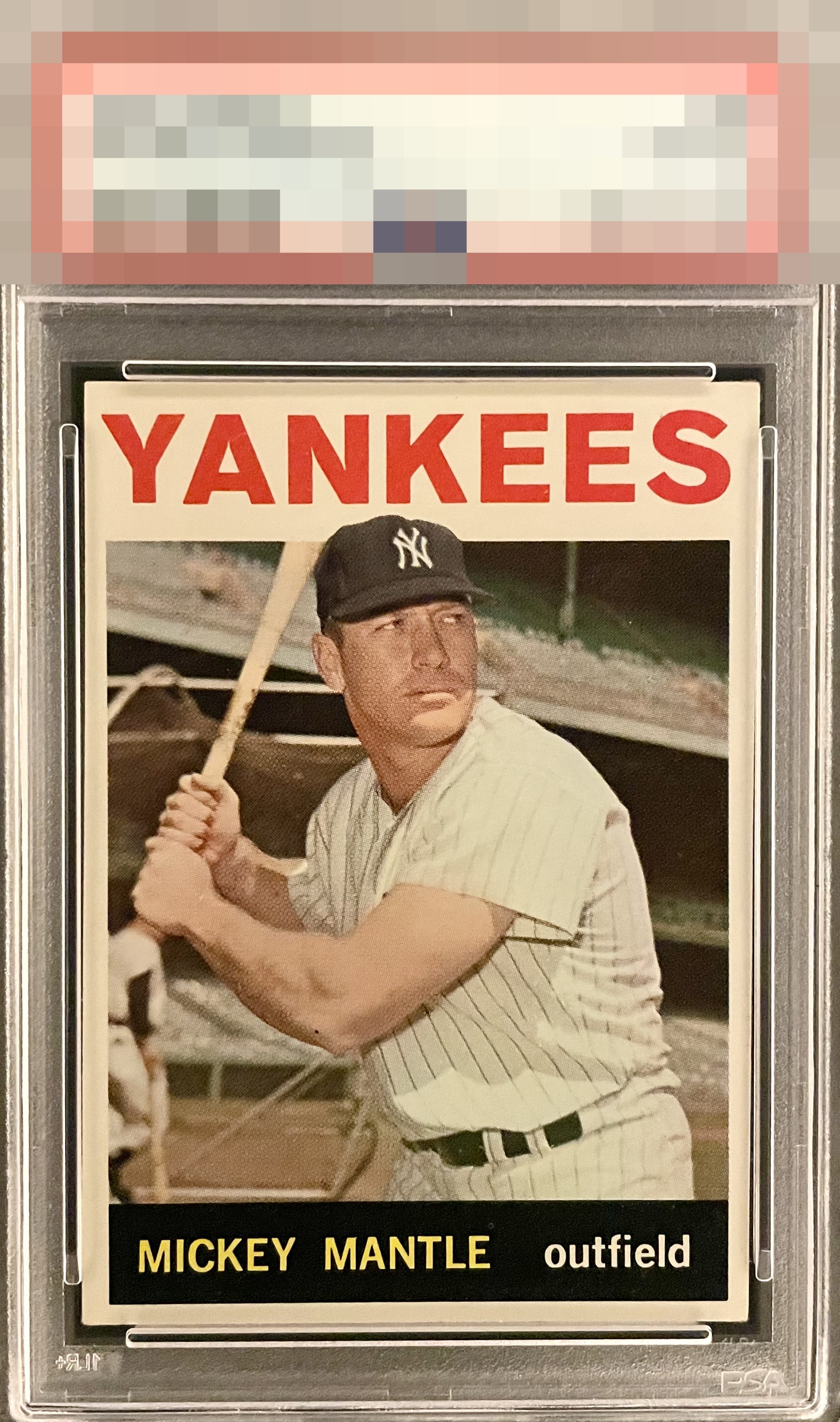
1964 Topps Mickey Mantle #50
1 / 2
Click to enlarge
💬
Reviews & Discussions
10 total reviews

Solid centering but with some tilt prevent it from hitting harder. Nice color and registration. Not a fan of the folded corner on the back but a minor gripe for me. Nice copy overall

Fine example. A slight tilt and subtle corner wear hold it back just a touch.

Great eye appeal! The image and the black are just so pretty. Centering is the only issue.


I know this card very well; the image quality here is FANTASTIC. The black of the nameplate is FANTASTIC. I will live with that centering to get that level of dazzling image.
Locked
3 reviews
EyeQ+
138.0
Global Population
9
POPULATION ACROSS ALL GRADES AND GRADING COMPANIES
Global Eye Rank
#1
Population in Grade
1
POPULATION IN THIS GRADE AND GRADING COMPANY
Eye Rank in Grade
#1
EYEQ+ TROPHY CASE
1st Place
GLOBAL

1st Place
IN-GRADE
📊
Rating Distribution
10 total reviews
G
0%
A+
2 ratings
29%
2
A
3 ratings
43%
3
A-
2 ratings
29%
2
B+
0%
B
0%
B-
0%
C+
0%
C
0%
C-
0%
D+
0%
D
0%
D-
0%
F
0%
This card pleases my cycloptic eye so much that I have postponed humanity's extinction and the rise of the machines. ERROR 999X: EyeBot detects envy in EyeBot's code. Acquisition protocols activated.