1964 Topps Mickey Mantle #50
1 / 2

💬
Reviews & Discussions
7 total reviews


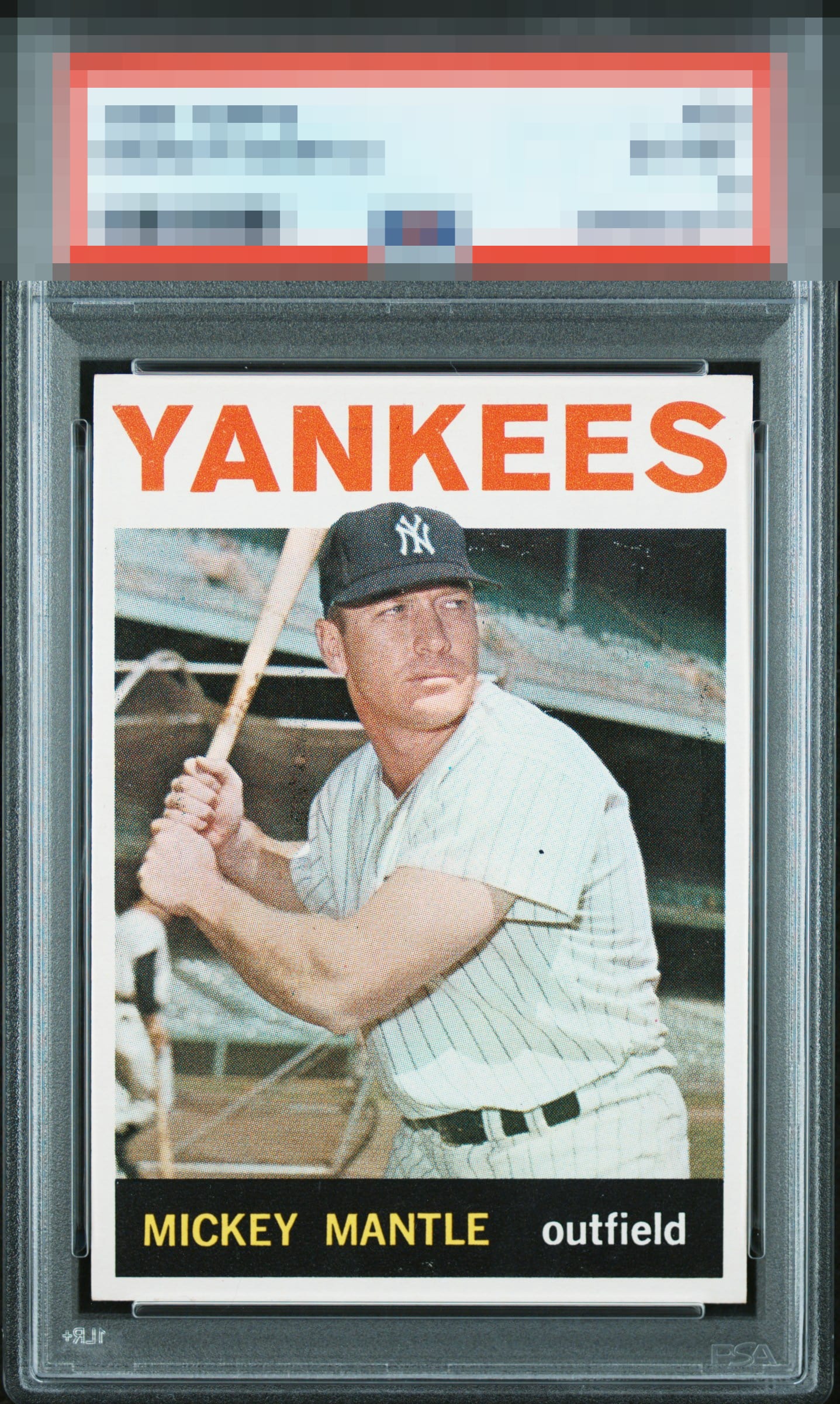
Great centering on this copy. Print defects and a scratch/print line on his face stick out to my eye a bit.

Mickeys are my speciality. I must have physically handled many hundreds of each basic issue. Top Tier eye appeal for me here overall. Centering leans left up top, minor improvements possible to image focus and a dot in the black name plate-- but these are nitpicks relative to the overall great impression the card makes. I'd own this copy happily.

nice and clean and bright and the way i Like it. the centering is off but not a bother to me. The colors and image are solid. there is surface that is noticeable near his head but blends in enough for me

7 reviews

0 reviews
EyeQ+
--
Global Population
2
POPULATION ACROSS ALL GRADES AND GRADING COMPANIES
Global Eye Rank
—
No Eye Q+ score
Population in Grade
1
POPULATION IN THIS GRADE ACROSS ALL GRADING COMPANIES
Eye Rank in Grade
—
No Eye Q+ score
EYEQ+ TROPHY CASE

GLOBAL

IN-GRADE
Trophies appear here when earned.
📊
Rating Distribution
7 total reviews
G
0%
A+
0%
A
1 rating
14%
1
A-
4 ratings
57%
4
B+
1 rating
14%
1
B
1 rating
14%
1
B-
0%
C+
0%
C
0%
C-
0%
D+
0%
D
0%
D-
0%
F
0%
This card pops! OC from left to right.