1964 Topps Mickey Mantle #50

Reviews & Discussions
13 total reviews

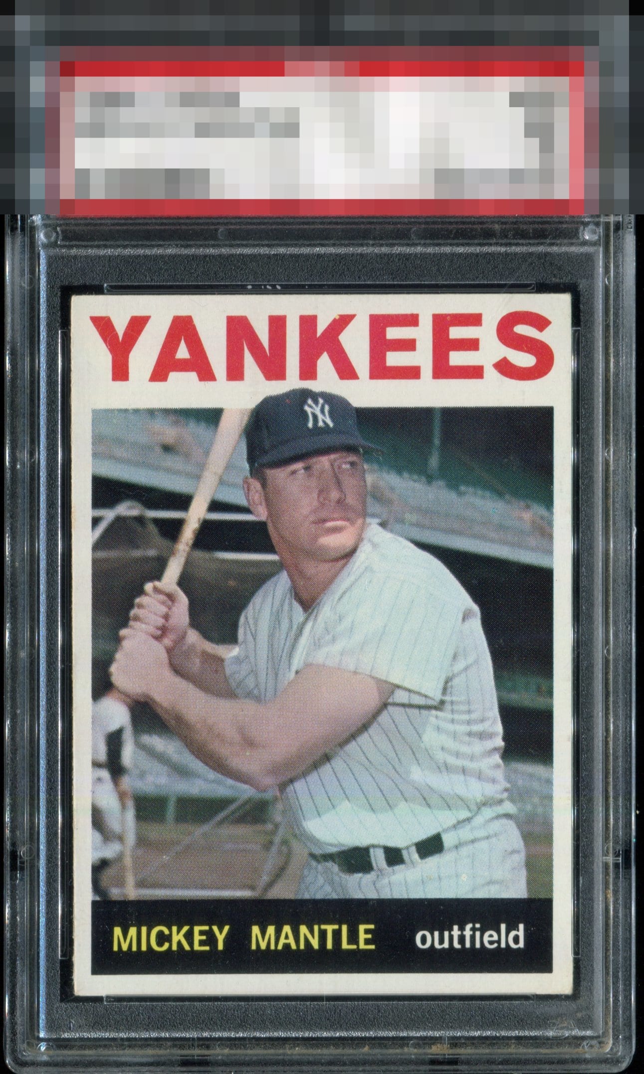
There is just zero I would want to upgrade for beauty here if I owned this card. I could nitpick the faint speck in the 'K' but that is not what we are here to do; it doesn't adversely affect the eye appeal; it's just me trying to find a flaw. This card's eye appeal is 100% pleasing to my eyes. GT.

Predominately white coloring, with near perfect centering carries the day here. The borders help me envision The Mick in Pinstripes

Love the bold and centered borders and the colors are strong. Just a great looking card

Great looking card, it looks a little off centered up and down but other than that, I love it.

Stunning. The centering and jet black stand out in the best way.


Not much to complain about here.. Stellar copy. Just a small print dot at the top of the K in Yankees

The black, just wow. Not a single dot. The centering is also cash money. I gave up on this and the 1965 because centering usually sucks.

EyeQ+
EYEQ+ TROPHY CASE


Rating Distribution
13 total reviews
Very nice example. Clean,strong centering.