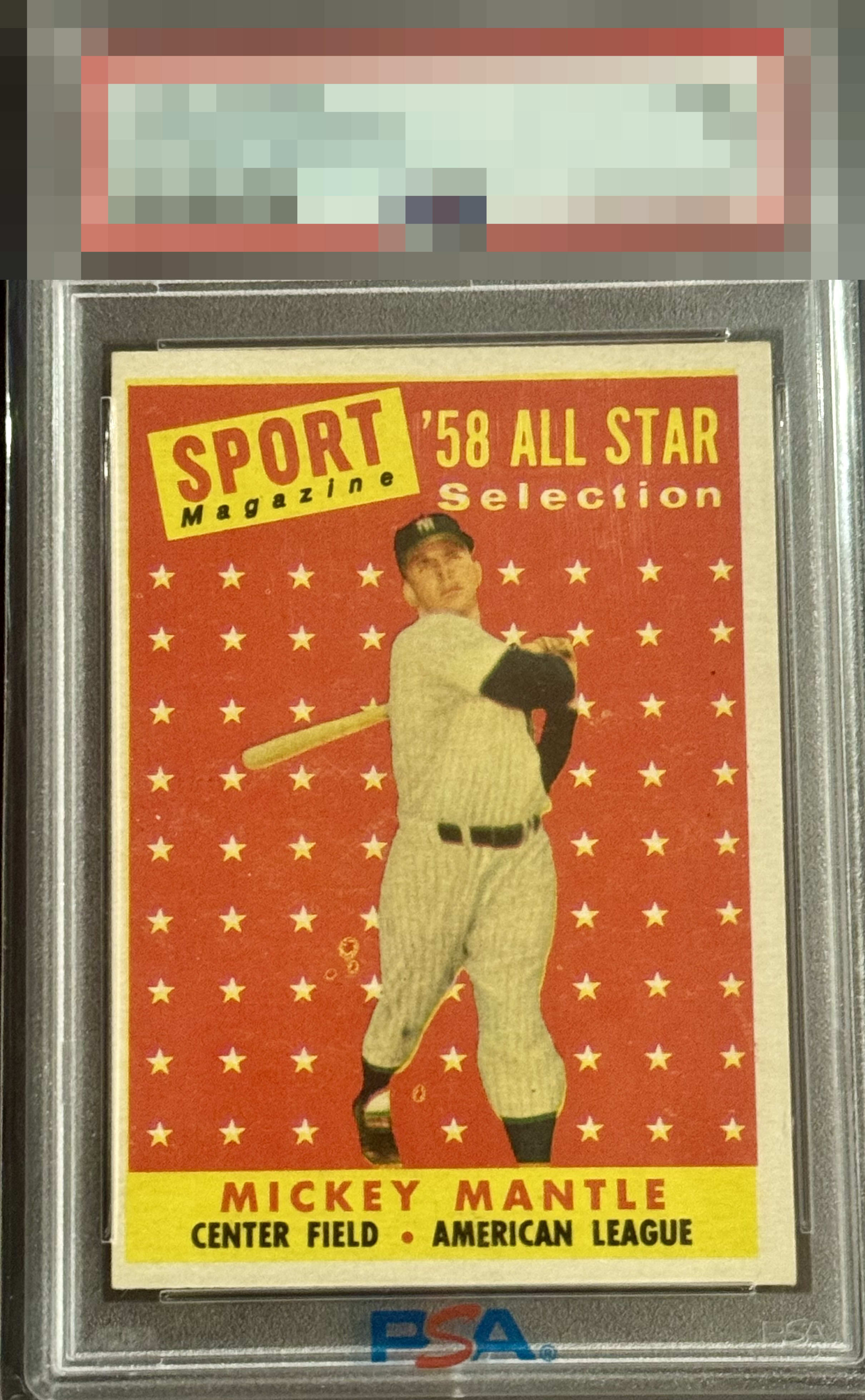
1958 Topps Mickey Mantle #487
1 / 2
Click to enlarge
💬
Reviews & Discussions
4 total reviews


nice colors and they do stand tall. The borders are off center and do not frame the image well. Seems like it is blurry but unsure if card or camera

Fish eyes and image blur due to a registration shift do take a toll on the eye appeal here, though the surface, edges, corners counteract those effects.

4 of 7 reviews

0 reviews
EyeQ+
--
Global Population
4
POPULATION ACROSS ALL GRADES AND GRADING COMPANIES
Global Eye Rank
—
No Eye Q+ score
Population in Grade
1
POPULATION IN THIS GRADE ACROSS ALL GRADING COMPANIES
Eye Rank in Grade
—
No Eye Q+ score
EYEQ+ TROPHY CASE

GLOBAL

IN-GRADE
Trophies appear here when earned.
📊
Rating Distribution
4 total reviews
G
0%
A+
0%
A
0%
A-
0%
B+
0%
B
0%
B-
2 ratings
50%
2
C+
1 rating
25%
1
C
0%
C-
1 rating
25%
1
D+
0%
D
0%
D-
0%
F
0%
This card is difficult to find w/o some random fish eyes. The R/L, B/T shift is noted but the colors and corners are enough for this example to retain a pleasant eye appeal.