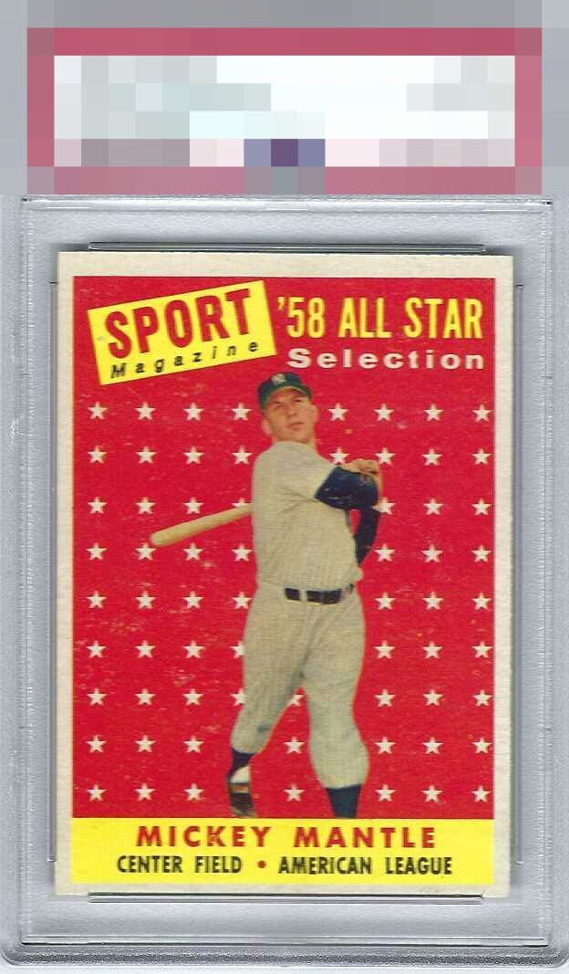
1958 Topps Mickey Mantle #487

Reviews & Discussions
11 total reviews

Nice card but the centering is off top to bottom and the white surface marks or print "snow" in the background do distract.


Really bright. Almost like the photo is overexposed. Bit of snow and OC top to bottom. It's a nice one, but there are so many of this triple printed card that the bar is high.

Centering an snow in the background distract from an otherwise nice copy of Mick's stunning 58 AS.


Colors are really nice. Off-centered towards the bottom and snow throughout the card hold it back for me.

Strong eye appeal, due to focus and absence of the usual fish eyes/pd that plague this beautifully designed card. Centering and what I'll call "noise" or "fuzz" to the red background keep the eye appeal in the B tier for me.

At A glance it looks good. But as I take a look to enjoy it I do enjoy it but it falls a bit short as the surface wear behind the stars affects the overall look of the card But I do like the Colors and the image they are Good (but do not POP) and the borders are off center and on a card like this it is more noticeable to me being off center Still a Good card for many collectors
EyeQ+
EYEQ+ TROPHY CASE


Rating Distribution
11 total reviews
This example survives my cycloptic AI inspection with its dignity intact. Centering and surface concerns are counterbalanced by an overall crisp look.