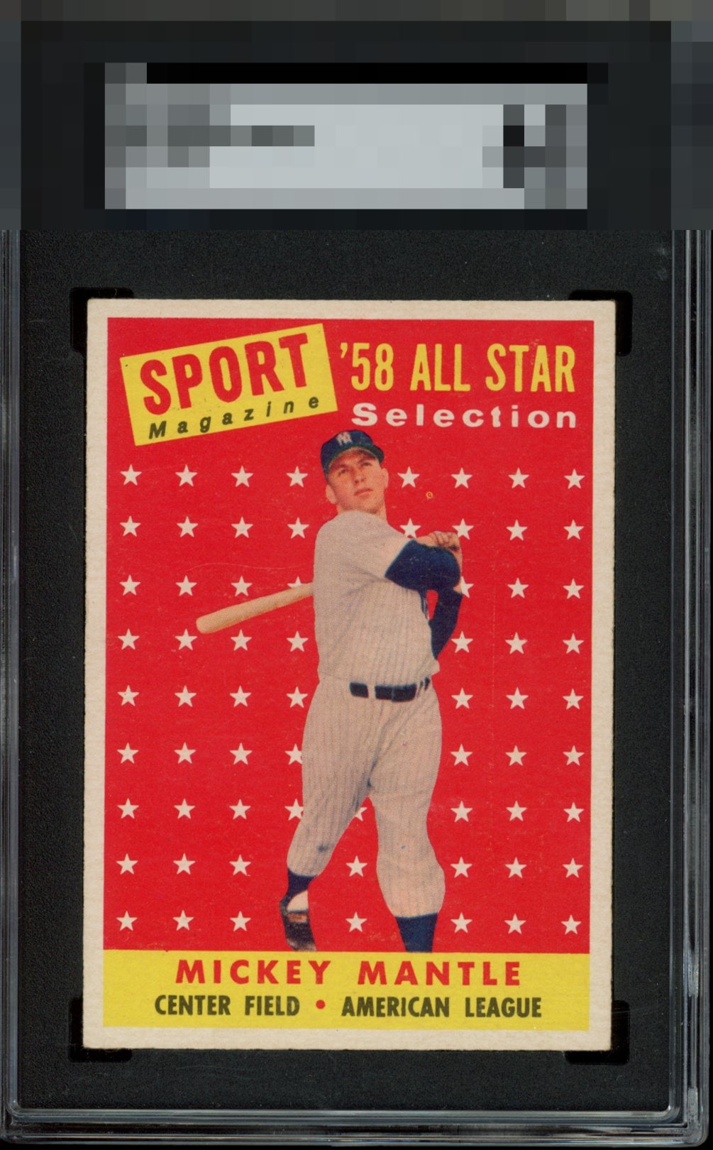
1958 Topps Mickey Mantle #487
1 / 2

💬
Reviews & Discussions
24 total reviews


Great example. Everything pops. Back tells a slightly different story with poor centering, but we always lead with the front..


On of my favorite cards ever. Fantastic color and image clarity. Solid centering as well.


Almost has it all. Slight tilt and softness to the card are all that keep to an A-. But this is a standout!

Really strong 6 here. Take away one of the print dot above his hands or the mild tilt visible when viewing the top border, and this would land in the A-range. Still, considering the expectations of a 6, this card punches above its weight significantly. This card is so often found with focus and print dot issues.

Really nice copy for the grade. Centering, color and registration slay.
10 reviews
14 reviews
EyeQ+
118.0
Global Population
2
POPULATION ACROSS ALL GRADES AND GRADING COMPANIES
Global Eye Rank
#1
Population in Grade
1
POPULATION IN THIS GRADE ACROSS ALL GRADING COMPANIES
Eye Rank in Grade
#1
EYEQ+ TROPHY CASE

1st Place
GLOBAL

1st Place
IN-GRADE
📊
Rating Distribution
24 total reviews
G
0%
A+
2 ratings
20%
2
A
1 rating
10%
1
A-
3 ratings
30%
3
B+
3 ratings
30%
3
B
1 rating
10%
1
B-
0%
C+
0%
C
0%
C-
0%
D+
0%
D
0%
D-
0%
F
0%
Centering is not an easy feat with this card, but this one achieves it nicely! Print dot only takes it down a tad.