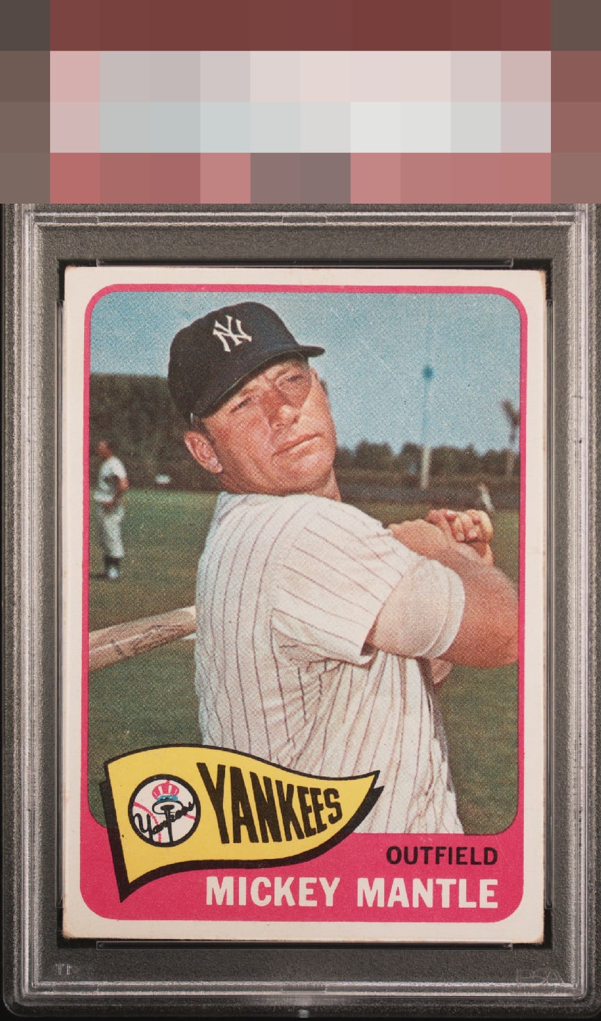
1965 Topps Mickey Mantle #350
Reviews & Discussions
13 total reviews

It's a minor miracle to find a '65 Topps Mantle with this centering. The corners and the fading keep this from the A+/God Tier zone for me. I would never let this one go.


like the color and presents well minor corner wear and the colors are not as bright as i have seen on others

Well chosen, my human friend. EyeBot detects flaws that are assigned gentle weight, as they do not offend my aesthetic sensor.

Centering leaps out to me as very attractive. No big issues. Corners are the problem and they're not even that damaged.

This is exceptional centering on a card I know extremely well. Clean name and team areas without PD as well. All I note is organic corner wear, which is what always fazes me the least. An example I would snap up and keep.
EyeQ+

EYEQ+ TROPHY CASE

Rating Distribution
13 total reviews
Good centering and image with noticeable corner wear the biggest distraction. Eye appeal remains strong.