1965 Topps Mickey Mantle #350
1 / 2
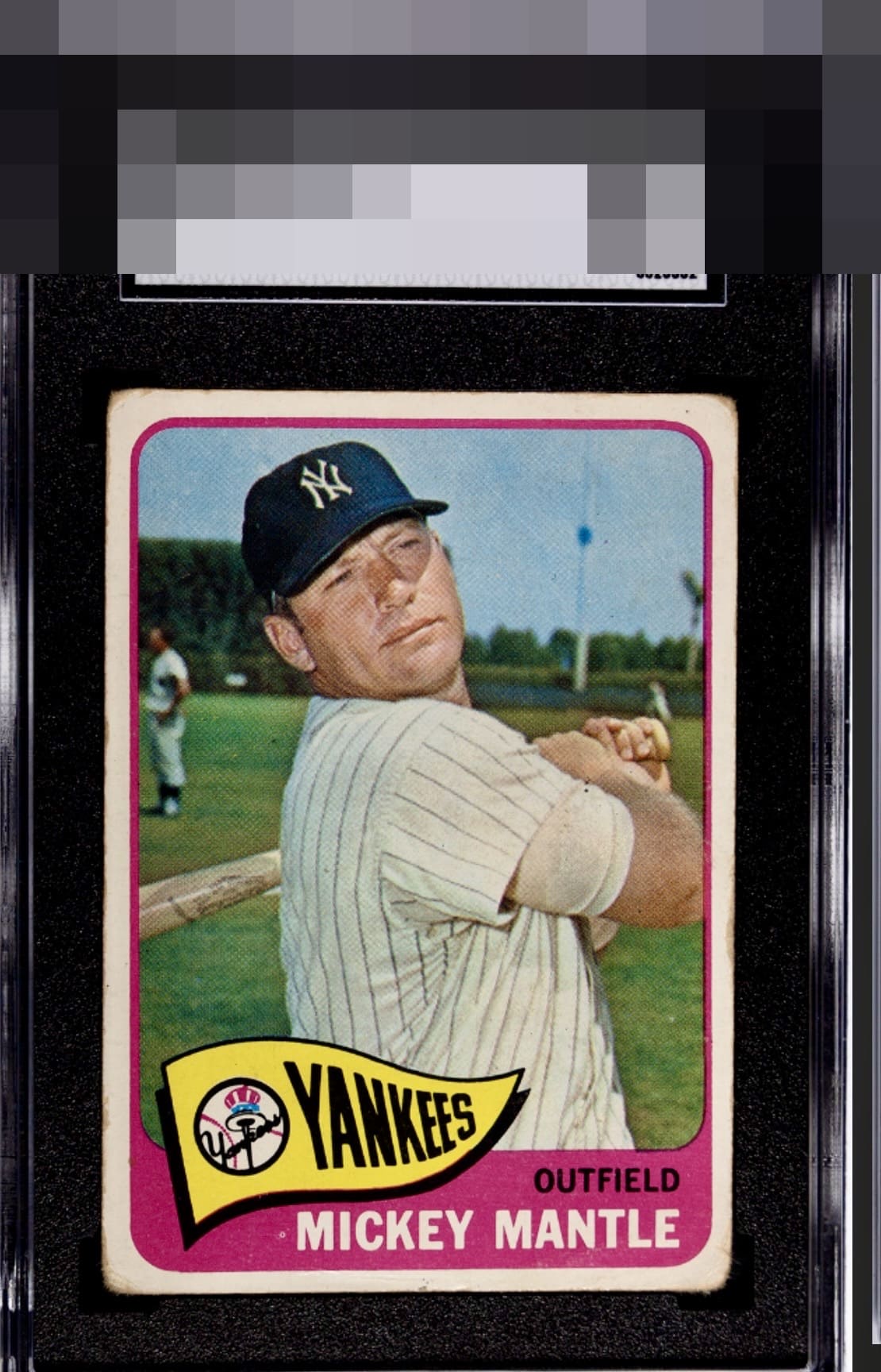
Click to enlarge
💬
Reviews & Discussions
4 total reviews


colors are solid as well as the image. Centering is ok but the corner wear and toning stand out

Good centering and an enjoyable image counterbalance the corner rounding and PD to the left of his name.

4 of 7 reviews

0 reviews
EyeQ+
--
Global Population
7
POPULATION ACROSS ALL GRADES AND GRADING COMPANIES
Global Eye Rank
—
No Eye Q+ score
Population in Grade
2
POPULATION IN THIS GRADE ACROSS ALL GRADING COMPANIES
Eye Rank in Grade
—
No Eye Q+ score
EYEQ+ TROPHY CASE

GLOBAL

IN-GRADE
Trophies appear here when earned.
📊
Rating Distribution
4 total reviews
G
0%
A+
0%
A
0%
A-
0%
B+
0%
B
1 rating
25%
1
B-
2 ratings
50%
2
C+
1 rating
25%
1
C
0%
C-
0%
D+
0%
D
0%
D-
0%
F
0%
Print dots can stand out on colored backgrounds and the corners show some pretty significant wear. Despite this, the centering and image overcomes these observations to retain a very attractive eye appeal.