1960 Topps Mickey Mantle #350
1 / 2
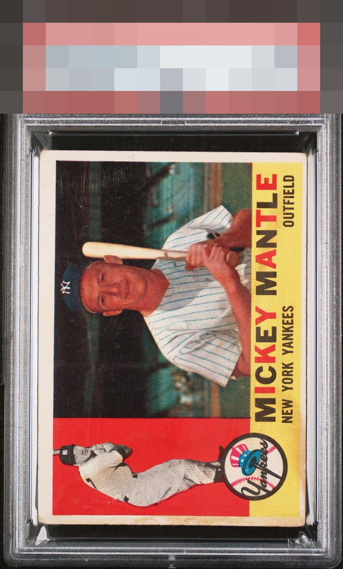
Click to enlarge
💬
Reviews & Discussions
4 total reviews


a mid tier card that would be a place holder for me. With the edges and staining really holding it back for me

The PD-free red and yellow areas are just what I look for in a 1960 Mick. Both Mick images are also focused, which is key. Centering and left edge staining make impact. The numerical system would probably say 2-3 out of 10, which is an F. But the eye appeal to me is much greater.

4 of 7 reviews

0 reviews
EyeQ+
--
Global Population
10
POPULATION ACROSS ALL GRADES AND GRADING COMPANIES
Global Eye Rank
—
No Eye Q+ score
Population in Grade
1
POPULATION IN THIS GRADE ACROSS ALL GRADING COMPANIES
Eye Rank in Grade
—
No Eye Q+ score
EYEQ+ TROPHY CASE

GLOBAL

IN-GRADE
Trophies appear here when earned.
📊
Rating Distribution
4 total reviews
G
0%
A+
0%
A
0%
A-
0%
B+
0%
B
0%
B-
0%
C+
3 ratings
75%
3
C
1 rating
25%
1
C-
0%
D+
0%
D
0%
D-
0%
F
0%
T/B centering shift, stained borders, and noticeable corner wear most effect the eye appeal on this example. The image and print are above average. Very nice eye appeal remains.