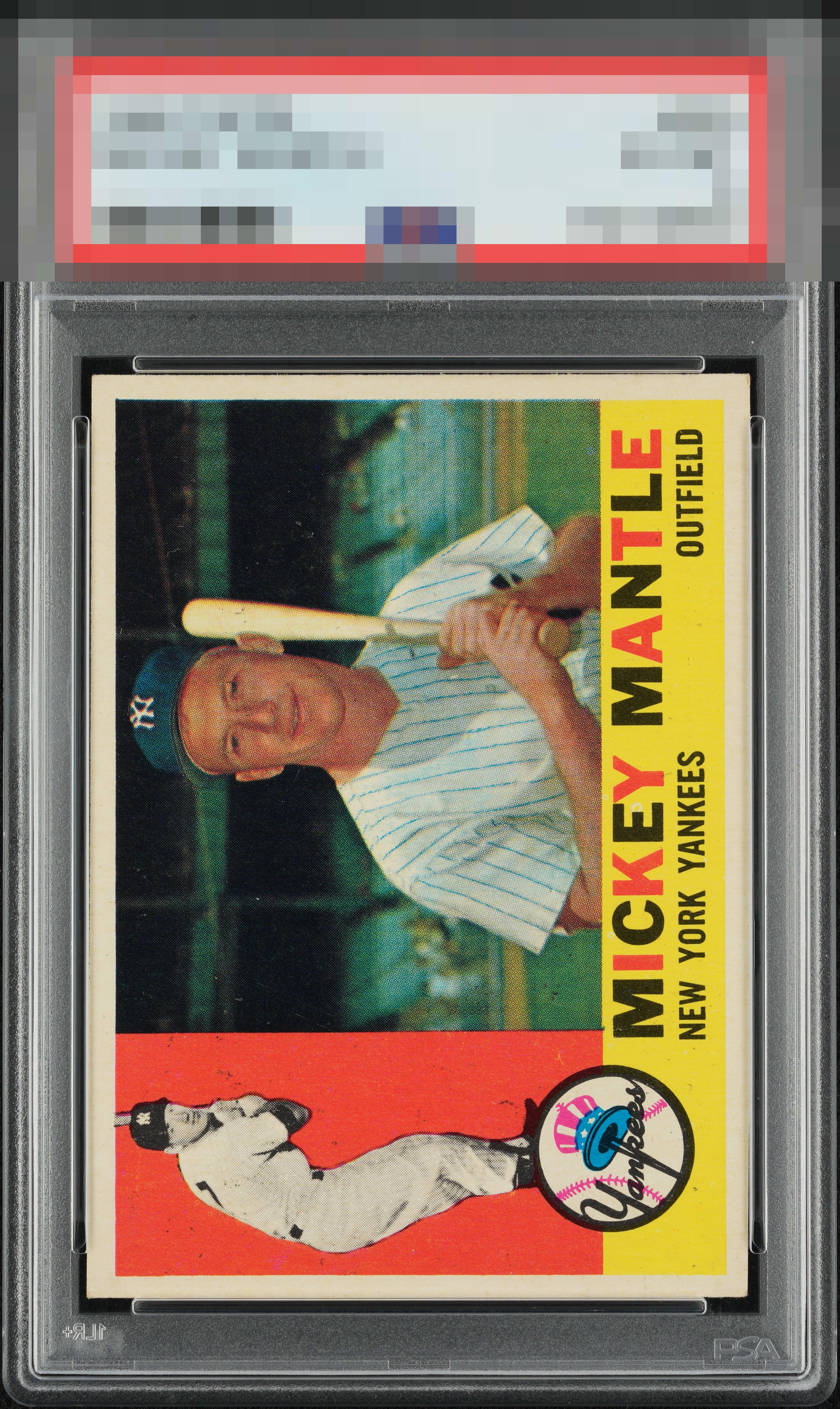
1960 Topps Mickey Mantle #350
1 / 2
Click to enlarge
💬
Reviews & Discussions
10 total reviews

The excess print in the red wasn't quite enough to knock it to the B tier for me as it's an exceptional card otherwise.


PD is the one issue but man the rest is outta sight including that A+ centering.


surface wear is all that holds it back to me from top Tier. Really like the look and the borders and the overall appeal

Overall look is top tier. Centering is A+. Some minor print flaws emerge on a longer, closer look, but these are not major distractions I'd be hell bent on improving were this in my display.
Locked
3 reviews
EyeQ+
120.0
Global Population
9
POPULATION ACROSS ALL GRADES AND GRADING COMPANIES
Global Eye Rank
#6
Population in Grade
1
POPULATION IN THIS GRADE ACROSS ALL GRADING COMPANIES
Eye Rank in Grade
#1
EYEQ+ TROPHY CASE

6th Place
GLOBAL

1st Place
IN-GRADE
📊
Rating Distribution
10 total reviews
G
0%
A+
0%
A
1 rating
14%
1
A-
5 ratings
71%
5
B+
1 rating
14%
1
B
0%
B-
0%
C+
0%
C
0%
C-
0%
D+
0%
D
0%
D-
0%
F
0%
That PD in the red is the only thing holding this Mick back from even higher eye appeal. Great card.