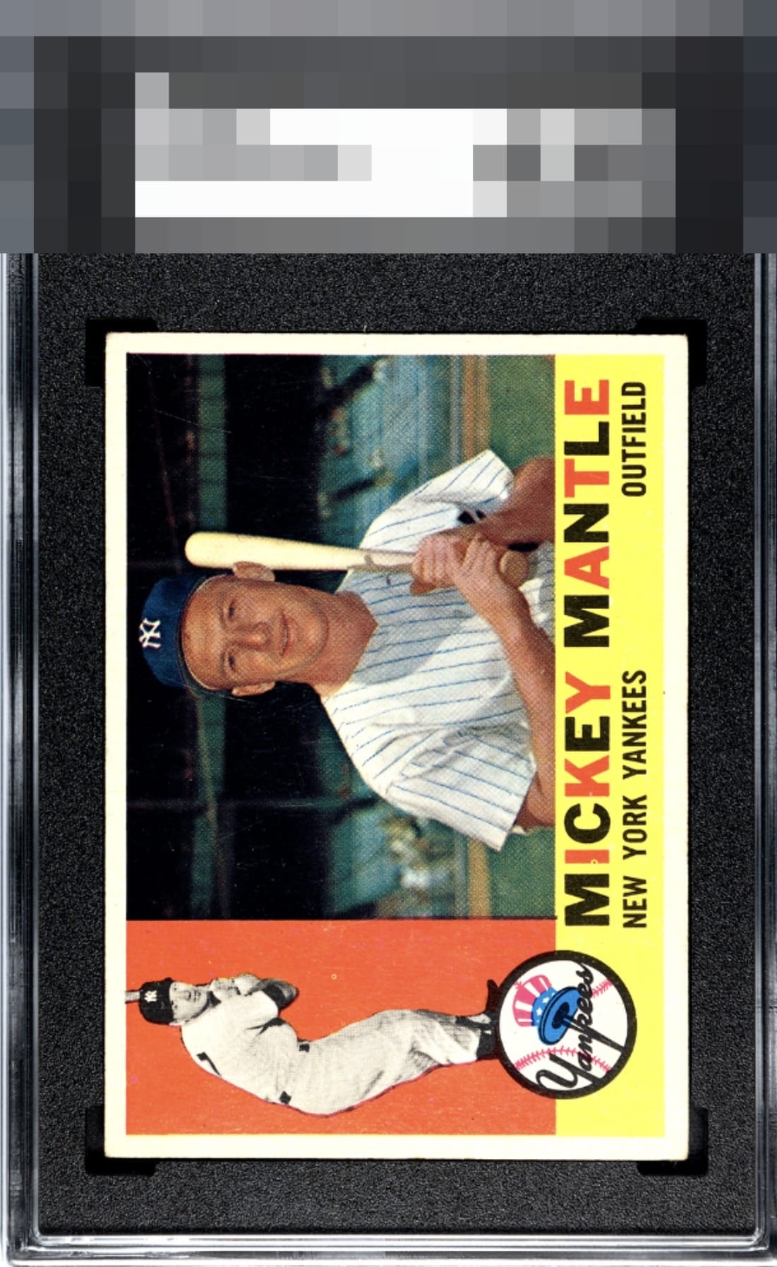
1960 Topps Mickey Mantle #350

Reviews & Discussions
12 total reviews

I knew this was A or A+ off the bat and after staring at it a minute or two nothing crept out to change that.

Minor imperfections in the red zone of this Mantle prevent entry into the God Tier, yet have no further consequence. I have noted this card's location, for future acquisition protocols.

Color is what you want to see. Just some excess print as is so common


What a great copy. That image looks crispy and the centering looks on point to me! My only notes are a print dot on the ‘I’ and within the red area, which hold it back from an even bigger grade.

It amazes me how crisp focus affects this card. It's easy to not notice unless you see several of them or shop for one. This is a great overall example and a speck in the red is the only thing that draws my attention repeatedly in terms of flaw.

Love those borders as they are clean, bright and well centered. The colors and image are sharp

Well-centered and strong image. A few imperfections in the red on the left.

Awesome looking Mick with GT centering and near perfect clarity. One small PD in the red peeks out.
EyeQ+

EYEQ+ TROPHY CASE


Rating Distribution
12 total reviews
Very clean card with excellent centering. The colors look great and the borders are bright white. A couple of print defects and some minor corner wear are the only issues I see, but I would buy this card.