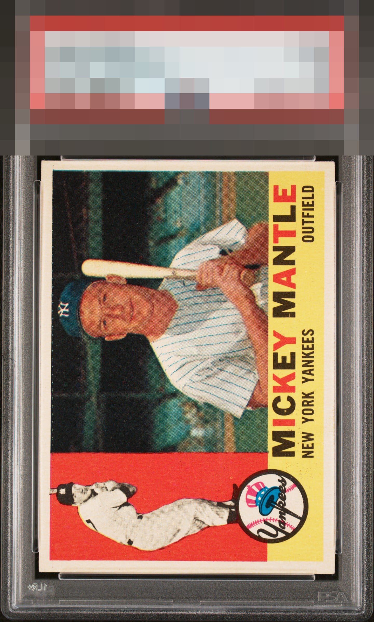
1960 Topps Mickey Mantle #350

Reviews & Discussions
11 total reviews

Just a bit of tilt but everything else is nice. A couple of easy to miss fisheyes aren’t a big deal.

Elite eye appeal in my estimation. The two notes I have are side centering and that line across the top of the main panel photo that many copies exhibit. Reminds me of the black line that some 62 Mantles have at the bottom, in a way.


I love me some centered 60T Mantle. Great coloring and registration too.

Hits the eye nicely overall with clean red and focus all around. The dotted print line across the top is present yet not as pronounced on some examples.

Love the overall look of the card as it has strong image, colors and the colors POP The centering is off but not noticeably as the borders are nice sized and clean. Minor surface wear holds it back from rating higher. But this is the type of card that truly Appeals to me

Very nice centering. Color and image look great too. Just one small print defects in the red background, but nicer than most.

This is a great example of a card I have owned a few of over the years. The batting pose is focused and there are no specks in the red. The main photo is also focused, and it can so often be found blurry. Centering and the faint beginnings of a horizontal print line often found across the top of the image are the only factors that lower the eye appeal.

EyeQ+
EYEQ+ TROPHY CASE


Rating Distribution
11 total reviews
Winner. No complaints.