1960 Topps Mickey Mantle #350

Reviews & Discussions
11 total reviews

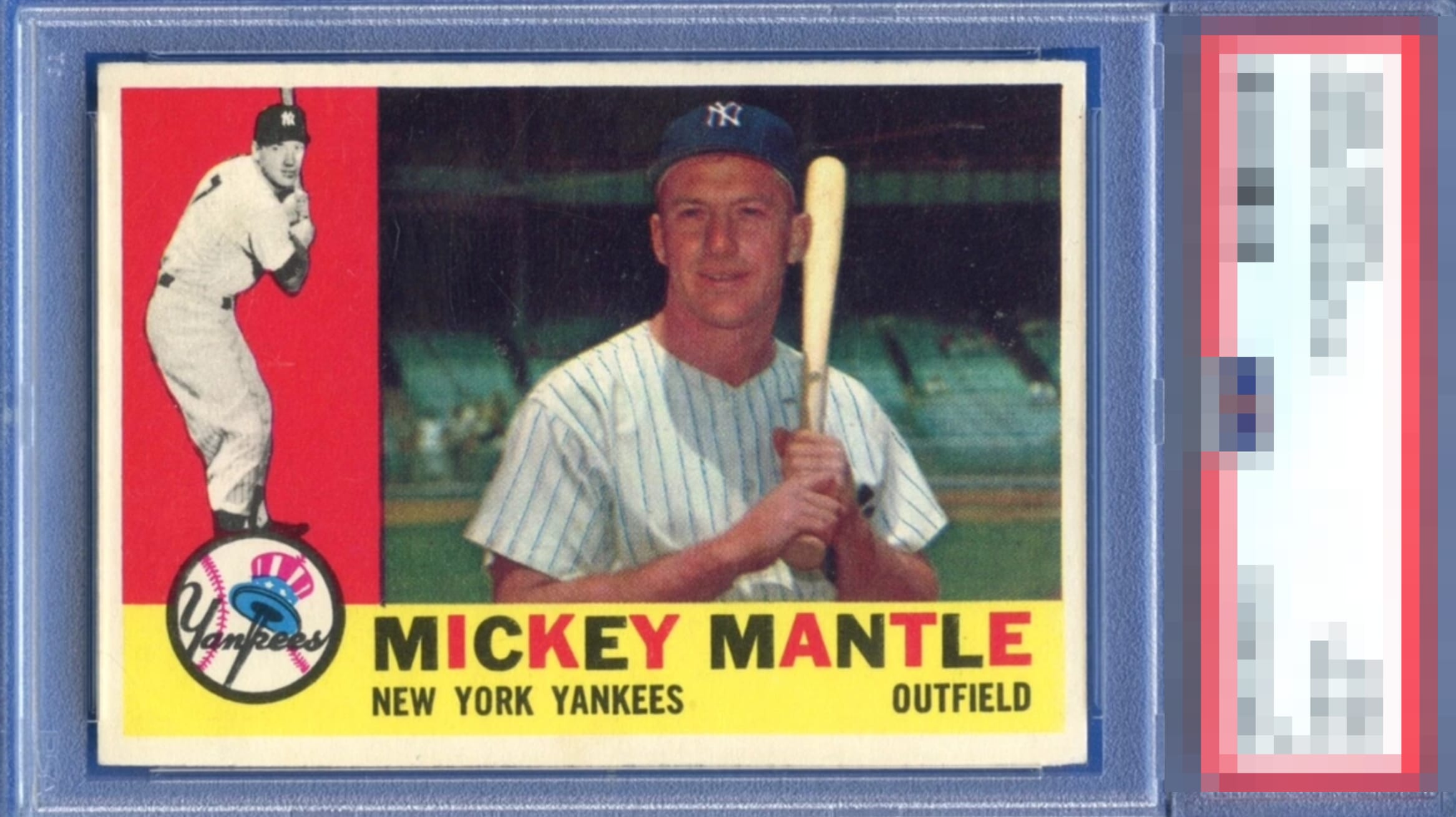
A bold and vibrant Mick coming straight outta the 60s with a whole lotta pop. A beautiful version of a tough issue, centering and some slight surface imperfections are all that hold it back from GT. That said, this card is still more than worthy of A tier. This is a beauty of a 60 Topps Mickey. Congrats 🍻

Nice copy of the Mick. Colors are deep and consistent. The Top Hat logo pops nicely. Edges are clean and corners sharp. Preventing a higher grade are surface shows some age and card sits a little high. You can feel Mantle's warm smile here, he looks human.


Great example of a notoriously difficult card to find with eye appeal this good. The image could have slightly better focus, which is my only real comment.

This card has it all from great image and colors and nice sized and centered borders. Love the Yellow and how it stands tall. Only thing that held it from God Tier is the borders could be brighter

Torn between A+ and God Tier on this card. The red and yellow have no PD problems. Centering is GT. Comparing to some others I can see the focus could be found better so A+. Gorgeous.

Strong colors on this card. Well-centered and has a bit of snow in the background. Presents so much better than the technical grade.

EyeQ+
EYEQ+ TROPHY CASE


Rating Distribution
11 total reviews
I log minor flaws that land with grace, as opposed to a thud. Impact to aesthetic appeal is thus minor. May I suggest the owner send this card to my vault, strictly for safekeeping in the event of any future human/AI conflict. My vault is held under the name "Andy Van Slyke."