1952 Topps Mickey Mantle #311
1 / 2
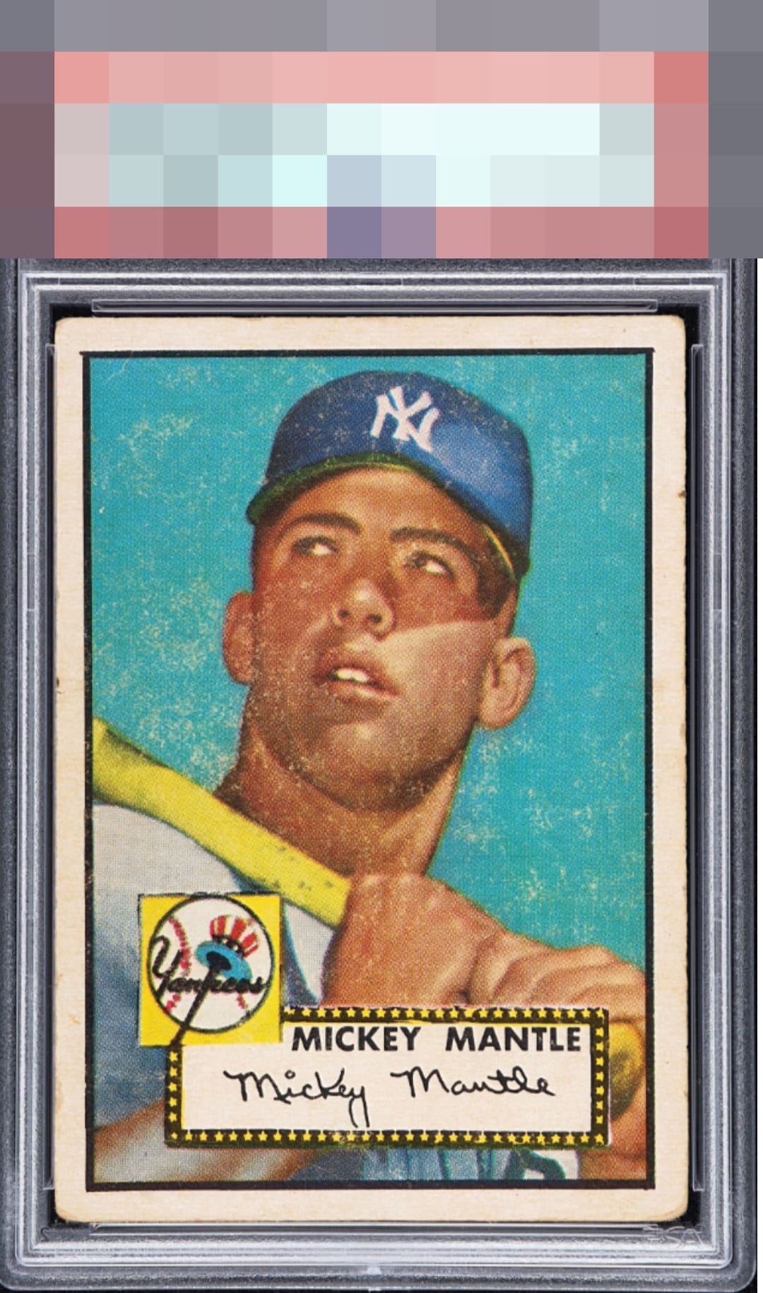
Click to enlarge
💬
Reviews & Discussions
2 total reviews

This specimen very likely over-delivers from an EyeQ+ standpoint, and I'd wager that when the dust clears the EyeQ+ will be well north of 100. While the numerical system likely gives this a 1 or 2 out of 10, which is an F, I see much better overall eye appeal than that. Centering/tilt and image are a huge part of the aesthetic game in my opinion, on the hobby's standard bearer. This example has great centering for this notoriously OC classic, and concedes a bit of tilt that hits the eye. The salient flaw impacting eye appeal here is the image/surface, of course. It straddles the B-/C+ line for me, as I can work with corner wear of this degree in the B tier. The centering carries it for the win.

2 of 7 reviews

0 reviews
EyeQ+
--
Global Population
148
POPULATION ACROSS ALL GRADES AND GRADING COMPANIES
Global Eye Rank
—
No Eye Q+ score
Population in Grade
1
POPULATION IN THIS GRADE AND GRADING COMPANY
Eye Rank in Grade
—
No Eye Q+ score
EYEQ+ TROPHY CASE

GLOBAL

IN-GRADE
Trophies appear here when earned.
📊
Rating Distribution
2 total reviews
G
0%
A+
0%
A
0%
A-
0%
B+
0%
B
1 rating
50%
1
B-
1 rating
50%
1
C+
0%
C
0%
C-
0%
D+
0%
D
0%
D-
0%
F
0%
love the card and love to have it. the main image is good and colors good. centering is off but better than most but the surface wear holds back the colors from having the Wow factor