1952 Topps Mickey Mantle #311

Reviews & Discussions
11 total reviews

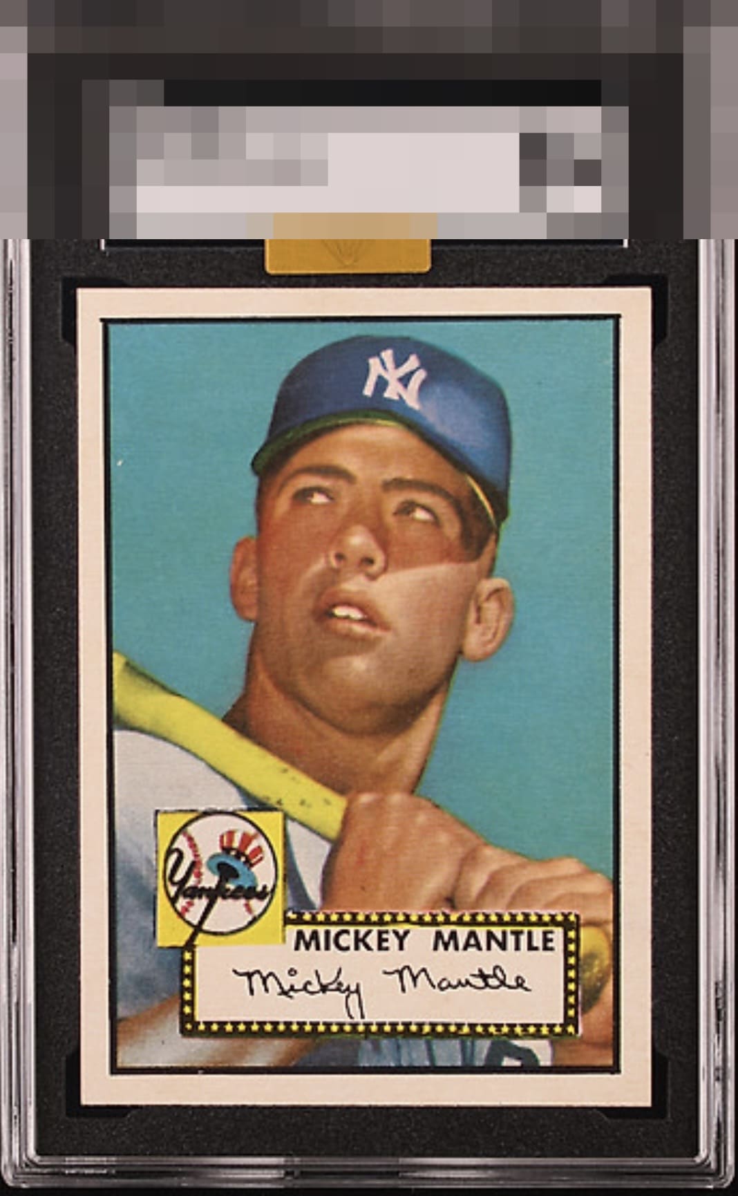
Holy moly this must be among the finest copies in existence. Only the centering holds it from God Tier. And the centering is amazing just not pefect.

This is a shockingly pack fresh looking card firmly in the upper eye appeal echelon of 52T Mantles. The more I look at this one the less I care about the slight tilt others will inevitably point out. This card is a masterpiece. Period.

Great example of this icon. The tilt and speck of white in the upper left are the only hold backs. Color, registration, corners and edges are all tops. It is not hard to look into Mick's eyes and forget the rest

So sharp and crisp, enough to land in the top echelon. Yet centering and tilt obviously dampen eye appeal to a degree.

Great copy of one of my favorite cards to me. The overall presentation looks really sharp, with the crisp white borders being my favorite part.

Great card with a tilt. But you can see the SGC slab and the gold sticker — which means it didn’t cross and somehow MBA gave it the gold as a consolation prize. Whatever it is, it’s a grade or two lower in PSA.

I will take it Love the Big Bold Borders(held back from GT by centering) Wow on the color and how crisp and clear the image is WOW and WOW and to be transparent I am drooling

Image and colors really stand out. Surfaces look very clean. The centering is a bit shifted to the left with a very subtle tilt.

Top Tier overall, yet the centering and tilt dampen eye appeal for me a little bit. The general sharpness and out-of-the-pack impression help offset that one salient aesthetic flaw. If I could just put a subtle micro-wrinkle on the back and make that centering perfect, it would be my ideal specimen ;) A great example, even to a centering and tilt stickler like myself!
EyeQ+
EYEQ+ TROPHY CASE


Rating Distribution
11 total reviews
Just some tilt and centering otherwise looks clean.