1952 Topps Mickey Mantle #311

Reviews & Discussions
10 total reviews

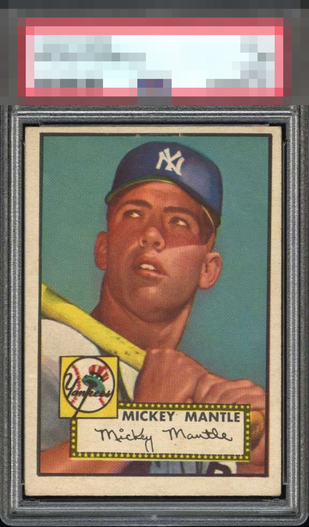
This is a weird one to grade. I see the staple holes and, yes, it is OC and tilted. That said the color is so rich, which allows Mantle's image to stand out..

Centering and the holes would make me think automatic C Band, but the clean background and image of Mick really do shine through! As a result this makes the B Band for me which is strong.

Looks like staple holes on top but pretty subtle. Clear image with relatively decent framing for this card. Crown jewel of most collections.

Despite the centering issues, this card has quite a few things going for it. Most obvious is the strong image quality and lack of any surface wear or creasing. Centering holds it back.

love the image and sharpness of the colors. Centering is an opportunity but not as dramatic as many of the cards i have seen. lite wear on the borders but overall a card i would be proud to own

Nice image and color. Like many ’52Ts, the centering looks off to me and holds it back.

The colors and image are excellent. Clean background as well. Don't mind the staple holes on the top since it's along the black outline. Obviously, the centering is the main issue. Presents very well overall.

Off center in a way that’s not too bad and a beautiful image and solid blue background. The staple holes are a legitimate concern, although for a budget copy you could do a lot worse.

The image and critically important blue background are strong enough to counterbalance the extreme centering shift, and land the eye appeal in the second tier. What appear to be staple marks don't really bump me much and the back centering does not factor in for me. A very pleasing image and ideal for someone not OCD about centering (like myself, LOL).

EyeQ+
EYEQ+ TROPHY CASE


Rating Distribution
10 total reviews
This is a great looking #311! The image is so clear, with good color and registration. Edges clean. Nothing breaks the card itself. The centering is off but in the best possible way, to the upper right. The card is grounded in the lower left, so this movement feels the most natural. Other than that for hold backs, the card feels a bit aged. Love this example