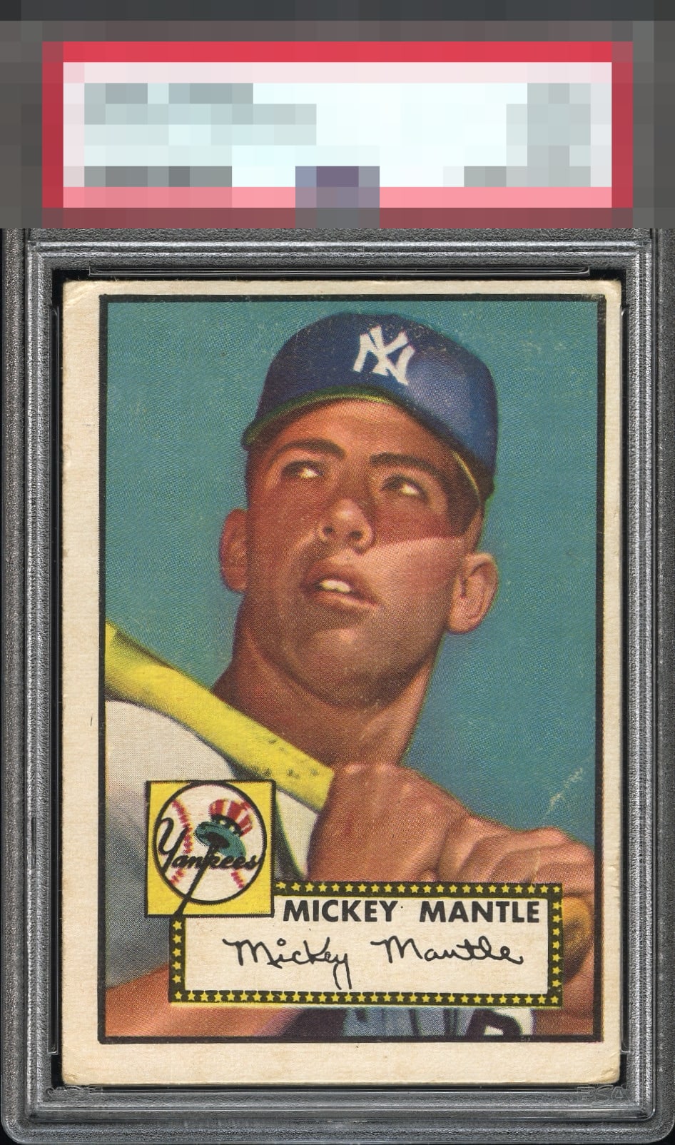
1952 Topps Mickey Mantle #311
1 / 2

💬
Reviews & Discussions
11 total reviews

Centering caps this one at a C for me. The image and colors are fantastic.

Down the middle C since Mick looks nice but the framing is very off.


The image looks nice, although there is surface damage throughout the card. Centering is the main issue, and there is more corner wear than I'd like to see.

Clean Mick and blue background are clutch here, and help counterbalance the extreme centering shift in both directions. The wrinkle by his hand is not a big issue for me.


Love the look of the image and the nice colors and the details in the card. The white crease impacts the look but i can overlook it it do to the sharp image The border shift of the centering holds it back
8 reviews
3 reviews
EyeQ+
--
Global Population
141
POPULATION ACROSS ALL GRADES AND GRADING COMPANIES
Global Eye Rank
—
No Eye Q+ score
Population in Grade
6
POPULATION IN THIS GRADE ACROSS ALL GRADING COMPANIES
Eye Rank in Grade
—
No Eye Q+ score
EYEQ+ TROPHY CASE

GLOBAL

IN-GRADE
Trophies appear here when earned.
📊
Rating Distribution
11 total reviews
G
0%
A+
0%
A
0%
A-
0%
B+
0%
B
1 rating
13%
1
B-
2 ratings
25%
2
C+
1 rating
13%
1
C
3 ratings
38%
3
C-
1 rating
13%
1
D+
0%
D
0%
D-
0%
F
0%
Sure it’s up and to the right with a light crease but this is where having centering tolerance helps me enjoy cards like this. Still a pretty Mantle that would be welcomed in any collection.