1952 Topps Mickey Mantle #311
Reviews & Discussions
8 total reviews

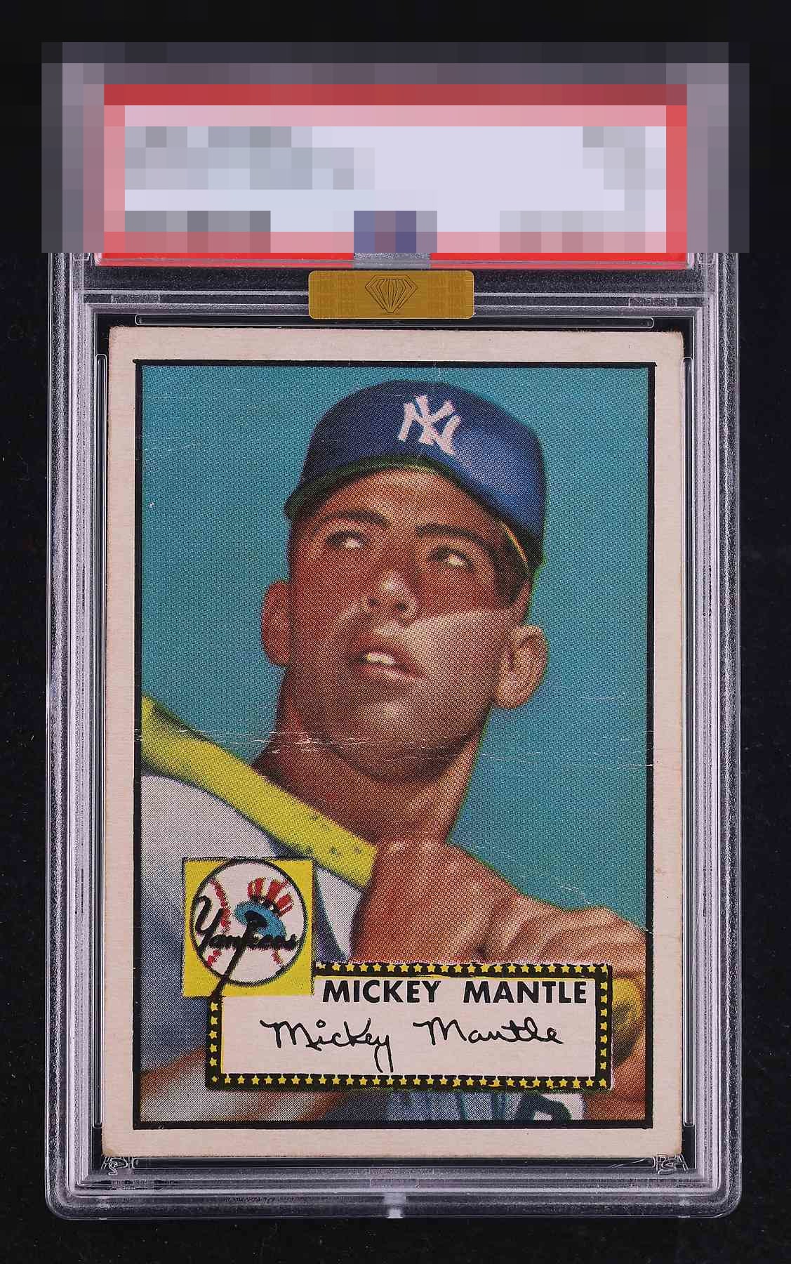
Love the centering, which is so hard to find like this. The crease prevents A Tier, but if it were just a little less pronounced it would slide into that top level.

I notice that on this card I am very easy on corner wear and very rewarding or harsh on centering and surface. The crease is the one flaw I care about here and that impacts it. Were it one of those creases that is hard to see I would have gone A- here.

My favorite card in the hobby, and they're so hard to find centered like this. The multiple creases including one through his chin lower the eye appeal but the centering keeps this just below A tier for me.

nice looking card with really nice centering the big horizontal crease and other creases holds it back

Pretty good centering and nice colors and image. The horizontal crease across the chin does draw my eye.

Love the centering and color. Great eye appeal. The prominence of that one crease just keeps it from the A-Tier badges is all.

This centering is almost as good as it gets for this card. The main eye appeal flaw for my taste is that large horizontal crease, and were it not as white the eye appeal here would flirt with A- for me. This is the kind of card that in a wall display from a casual viewing distance (which is how I roll) really shines. While I can be very forgiving on corners, the main crease keeps it from the highest aesthetic tier of eye appeal.

EyeQ+
EYEQ+ TROPHY CASE


Rating Distribution
8 total reviews
That center crease kills me.