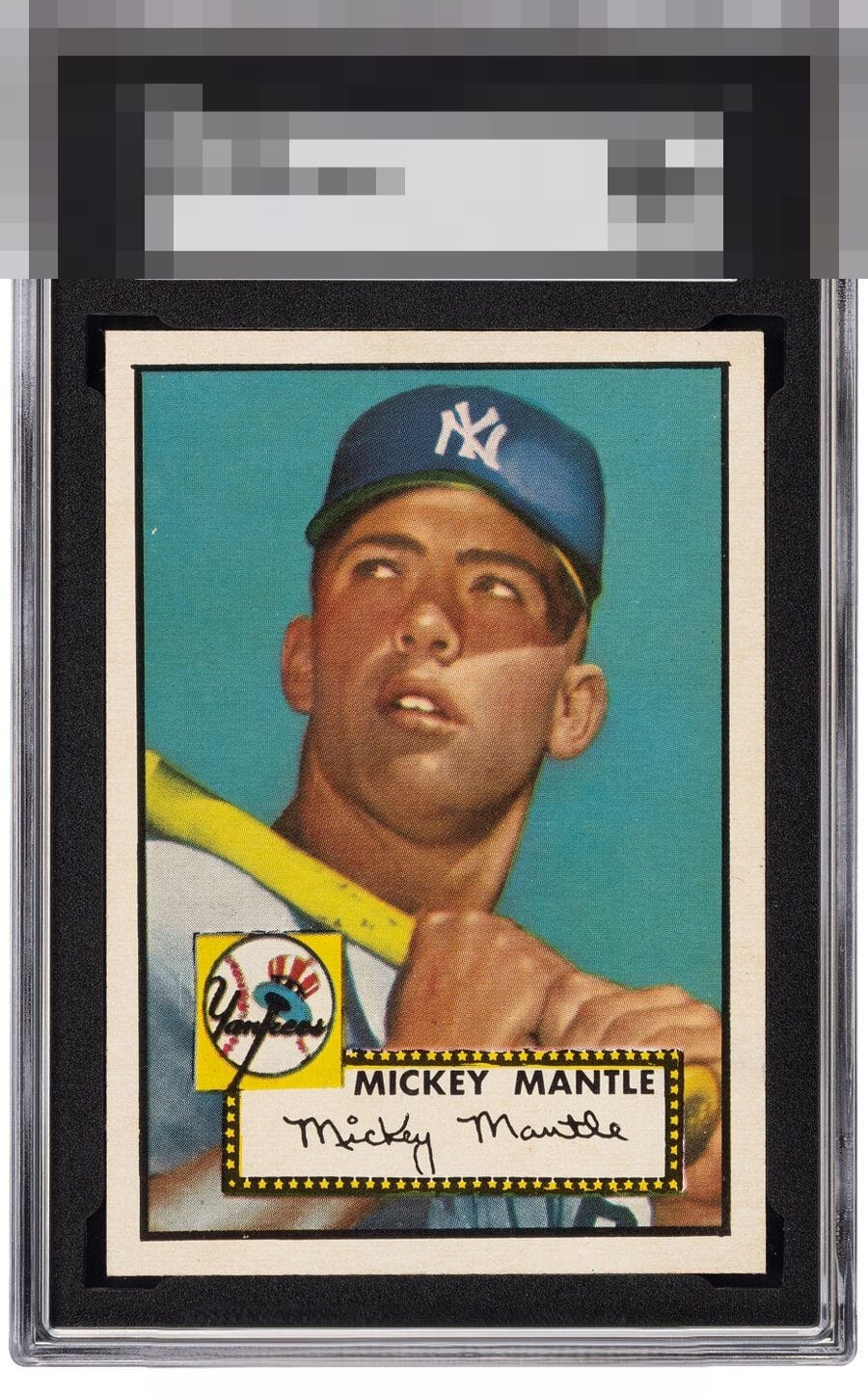
1952 Topps Mickey Mantle #311
Reviews & Discussions
7 total reviews

The tilt just cannot be unseen, and caps the eye appeal for me. Put a subtle wrinkle on the back of this card and fix that tilt, and it is God Tier eye appeal. Plus: it's then a 3 and much cheaper! Prettier & cheaper = better.


Image and color are as good as you're going to get. I'm a centering guy so that tilt would always irk me when I look at it.

The color, image, white borders, and sharp corners all look amazing. At this level though I would want better centering.

This card is God Tier for me. Everything jumps off the page for the right reasons and satisfies my hunger. Yes some might say centering if you really want to nit pick. But to me the nice size borders and the cleanliness and the centering is more than enough when you add in the sharp colors and strong image and the pure satisfaction I get just looking at it Fills me up and satisfied my hunger Great card
EyeQ+
EYEQ+ TROPHY CASE


Rating Distribution
7 total reviews
If this was a little to the left it would be perfect. Hard to find a better 52 mantle than this....