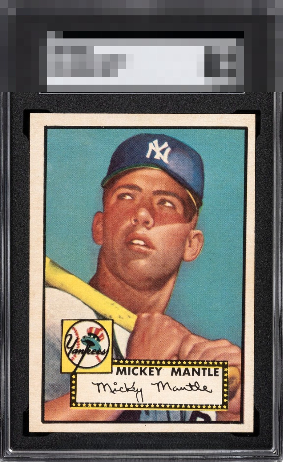
1952 Topps Mickey Mantle #311
1 / 2
💬
Reviews & Discussions
4 total reviews

The centering and tilt on this specimen are very distracting to my eye and unfortunately overshadow the card's other beautiful aspects. Tilt and centering cap the eye appeal here and prevent top tier.


Great looking card and minor surface wear and lack of border brightness that POPs is all that held this card back from God Tier All else is meant to be enjoyed Image, surface wear, color, border size and centering all send my senses into overload of joy
4 reviews

0 reviews
EyeQ+
--
Global Population
141
POPULATION ACROSS ALL GRADES AND GRADING COMPANIES
Global Eye Rank
—
No Eye Q+ score
Population in Grade
3
POPULATION IN THIS GRADE ACROSS ALL GRADING COMPANIES
Eye Rank in Grade
—
No Eye Q+ score
EYEQ+ TROPHY CASE

GLOBAL

IN-GRADE
Trophies appear here when earned.
📊
Rating Distribution
4 total reviews
G
0%
A+
1 rating
25%
1
A
0%
A-
1 rating
25%
1
B+
2 ratings
50%
2
B
0%
B-
0%
C+
0%
C
0%
C-
0%
D+
0%
D
0%
D-
0%
F
0%
Centering is off a bit too much for my liking but otherwise the card is fantastic.