1952 Topps Mickey Mantle #311
1 / 2
💬
Reviews & Discussions
5 total reviews


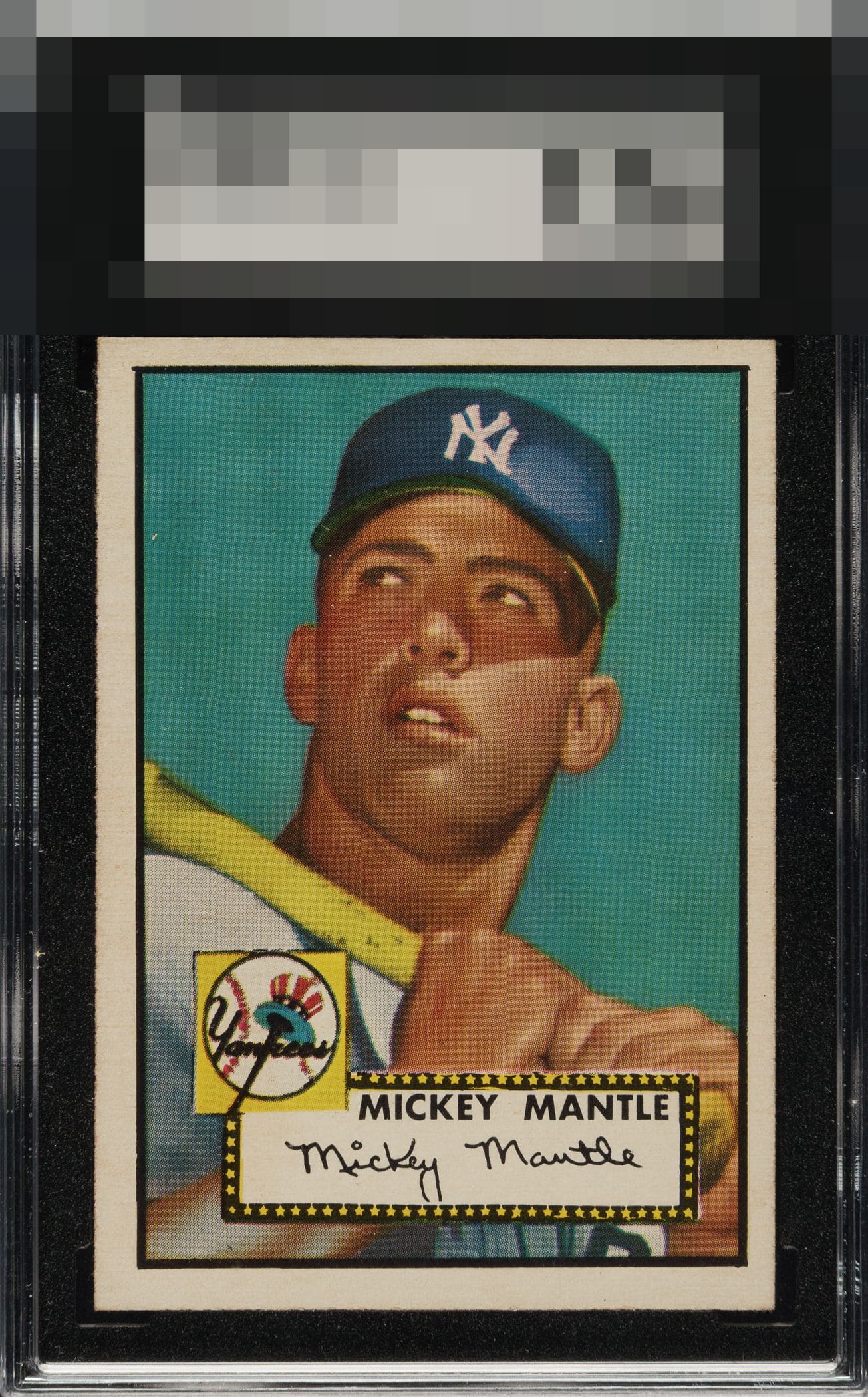
Color and image look great, borders are white and the corners look good to. At this level I would need better centering though.

Strong colors and image. Centering is a bit off but not as bothersome as others.

This is the card I would kill to have. This is a Great looking Mantle card Nit Pick is the few speckles in the back ground in upper left and the slight tilt The rest is Simply leaving me drooling Love the size of borders and the left right centering The colors and the image are both amazing Wow and Wow
5 reviews

0 reviews
EyeQ+
--
Global Population
141
POPULATION ACROSS ALL GRADES AND GRADING COMPANIES
Global Eye Rank
—
No Eye Q+ score
Population in Grade
6
POPULATION IN THIS GRADE ACROSS ALL GRADING COMPANIES
Eye Rank in Grade
—
No Eye Q+ score
EYEQ+ TROPHY CASE

GLOBAL

IN-GRADE
Trophies appear here when earned.
📊
Rating Distribution
5 total reviews
G
0%
A+
1 rating
20%
1
A
0%
A-
3 ratings
60%
3
B+
1 rating
20%
1
B
0%
B-
0%
C+
0%
C
0%
C-
0%
D+
0%
D
0%
D-
0%
F
0%
The centering keeps this from the top tier of badges, for me. The rest is fine.