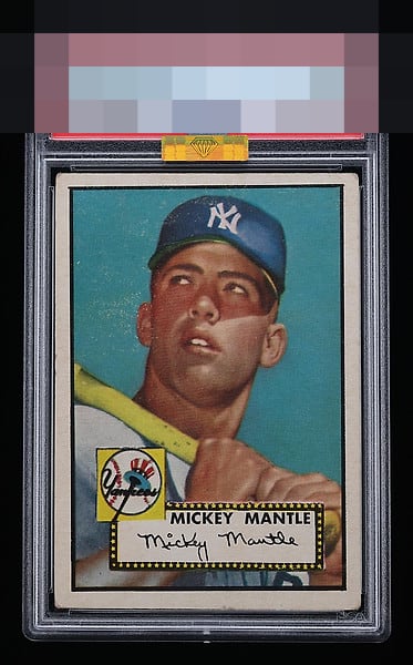
1952 Topps Mickey Mantle #311

Reviews & Discussions
12 total reviews

Well centered with beautiful colors on this Mantle rookie. Eye appeal is outstanding and a very high end example for the grade.

Can’t do much better for the grade. Some snow but a pretty strong card with good centering.

Centering is better than some high grade examples I've seen, but still off with some tilt. Blue looks great but some surface staining or scuffing towards the top lowers the appeal for me.

Solid example with better than typical centering and uniform corner wear. The only thing holding this back is the surface wear on Mick's face and cap and in the blue background.

Very nice colors. Reasonably well-centered but has some tilt and some surface wear by the face and on the cap that holds it back.

This is the exact version of this 52 Mantle that I'm looking for. So hard to find. Beautifully centered, yes it could be a little lower and the crease does not effect they eye appeal. Great find.

This looks good overall, better centering than many if not most, and the surface wear does not grab me at normal viewing distance like it does held super close up. This is one of the nicer looking '52 Mantles, actually.

Love the big and bold borders and then centering is off but better than most left/right but top/bottom is off more than i like. There is surface wear that affects the color and image quality. But punches above the slab and great card for anyone wanting a great quality card

This hits the eye lovely. Some surface wear and centering are the only dampening aspects. Really special.
EyeQ+

EYEQ+ TROPHY CASE

Rating Distribution
12 total reviews
My goodness! Unbelievable example for the grade. Slight condition issues barely detract. That color and centering!