1952 Topps Mickey Mantle #311
1 / 2

💬
Reviews & Discussions
12 total reviews

The centering alone would not hurt the eye appeal to the B- level, yet there is also a scuff in his cap that I notice and a blemish in the blue.

Tilt is strong, and the narrow top border is hard to ignore. I'd be happy with this of course, but we're not looking at off the charts eye appeal here.

Off centered. If the blue was free of any blemishes would have graded its eye appeal better.


Nice looking card and off centered but centering is nicer than most. The borders are bold and corners sharp The colors and image is strong. minimal white speckling but nothing distracting


10 reviews
2 reviews
EyeQ+
110.0
Global Population
141
POPULATION ACROSS ALL GRADES AND GRADING COMPANIES
Global Eye Rank
#27
Population in Grade
12
POPULATION IN THIS GRADE ACROSS ALL GRADING COMPANIES
Eye Rank in Grade
#4
EYEQ+ TROPHY CASE

GLOBAL
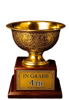
4th Place
IN-GRADE
📊
Rating Distribution
12 total reviews
G
0%
A+
0%
A
0%
A-
2 ratings
20%
2
B+
1 rating
10%
1
B
3 ratings
30%
3
B-
2 ratings
20%
2
C+
1 rating
10%
1
C
1 rating
10%
1
C-
0%
D+
0%
D
0%
D-
0%
F
0%
Centering and slant look to it.