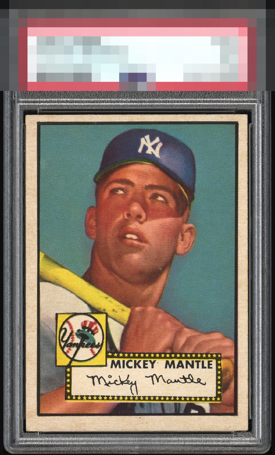
1952 Topps Mickey Mantle #311
1 / 2
Click to enlarge
💬
Reviews & Discussions
8 total reviews

I have to give this one an A despite the centering. The image and colors are just simply too powerful to ignore. Almost tempted to go higher with how deep the blue is.

Not tilty but the centering level prevents entry into the A Tier for me.

Great looking card and vibrant colors and strong image. Nice bold borders but slightlly discolored and off center. Overall Great Example


Locked
1 review
EyeQ+
117.0
Global Population
146
POPULATION ACROSS ALL GRADES AND GRADING COMPANIES
Global Eye Rank
#34
Population in Grade
13
POPULATION IN THIS GRADE ACROSS ALL GRADING COMPANIES
Eye Rank in Grade
#5
EYEQ+ TROPHY CASE

GLOBAL

5th Place
IN-GRADE
📊
Rating Distribution
8 total reviews
G
0%
A+
0%
A
2 ratings
29%
2
A-
0%
B+
3 ratings
43%
3
B
2 ratings
29%
2
B-
0%
C+
0%
C
0%
C-
0%
D+
0%
D
0%
D-
0%
F
0%
The image looks great. Centering top to bottom is the main issue but there's some toning around the borders and on the surface that has dulled the color a little.