1952 Topps Mickey Mantle #311
Reviews & Discussions
12 total reviews

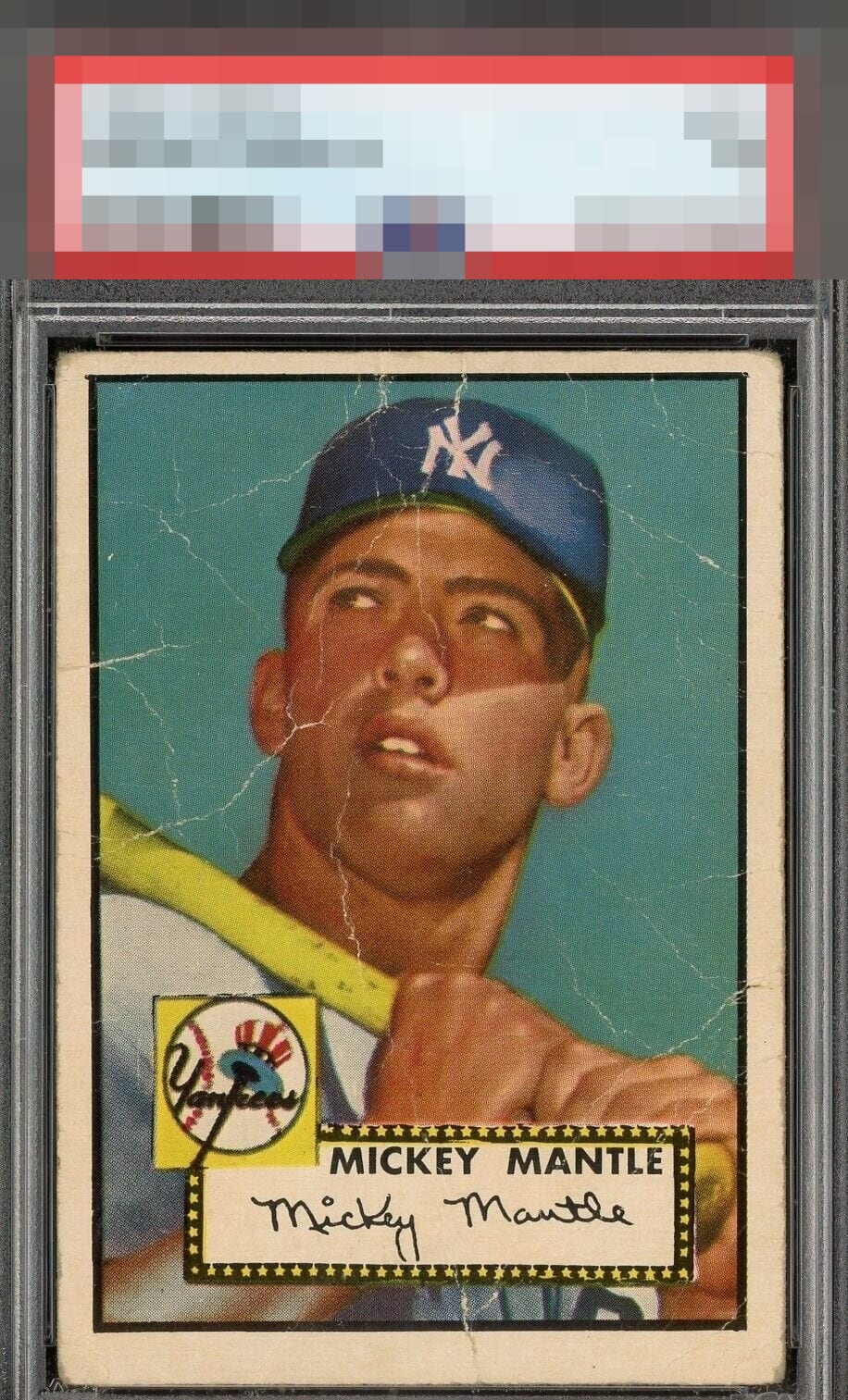
LR centering ok, but creases in the face really detract from my enjoyment of this card.

For a 52 Mantle, I could live with the top to bottom off center, but man, those creases are like a nuclear bomb for eye appeal. The color and registration were there too; which is unfortunate. I envision this card being taken to school, in the 50's, and passed around by buddies.


Not the worst example I've seen but all of those creases really hurt the eye appeal of this one. Color looks decent though.


The centering left to right is great but obvious other issues. Nice card for the grade even with the wrinkles

Too much creasing throughout the image to warrant a higher assessment. Fairly graded as a "1" but certainly on the nicer side of the 1 scale.

The various wrinkles are too much here and really act as a barrier to visual enjoyment.

looks like the card has a lot of cracks and in bad locations. Luckily they are thin and the color although faded the card still looks nice
EyeQ+
EYEQ+ TROPHY CASE


Rating Distribution
12 total reviews
Over delivers on eye appeal I would say, but remains C levels for me.