1952 Topps Mickey Mantle #311
Reviews & Discussions
11 total reviews

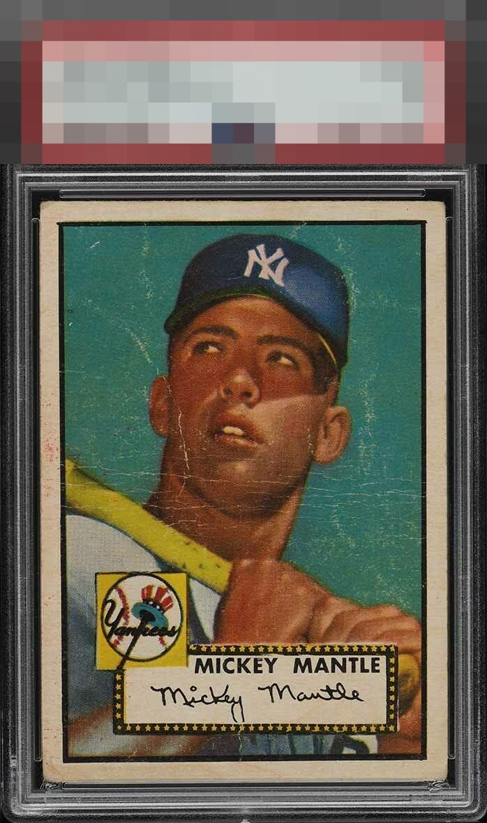
Great centering carries this card's eye appeal as far as it can, which is to an escape from the D Tier but no higher than C due to the severe scuffing and wrinkling.

"C" for centering here, which saves this card's eye appeal even with all that wear. Otherwise the eye appeal would sink into the D Zone.

This is awesome centering with a lot of surface wear. That centering carries it to a B-.

A centered 52 Mantle is very hard to find. This card has seen better days though, too many surface issues.

Exceptionally rare centering carries this card way up in the aesthetically pleasing department, to me. It would get B+ without the main crease on his cheek. Somehow, the wear in the blue even looks cool. Like a weathered rock star whose seen a lot of bars and clubs yet remains attractive.


Too much wrinkling to warrant any higher than a D range eye appeal grade but avoids an F due to the centering.

the card has white lines thru out and a few discolorations on the left border. neither of these truly takes away from the card overall appeal. The borders are all nice and bold and the centering is good. The colors and image are overall respectable
EyeQ+
EYEQ+ TROPHY CASE


Rating Distribution
11 total reviews
Aside from the obvious damage the rich colours of this one really appeal to me and the centering is solid. It is a copy I would truly appreciate owning.