1952 Topps Mickey Mantle #311
1 / 2
💬
Reviews & Discussions
7 total reviews


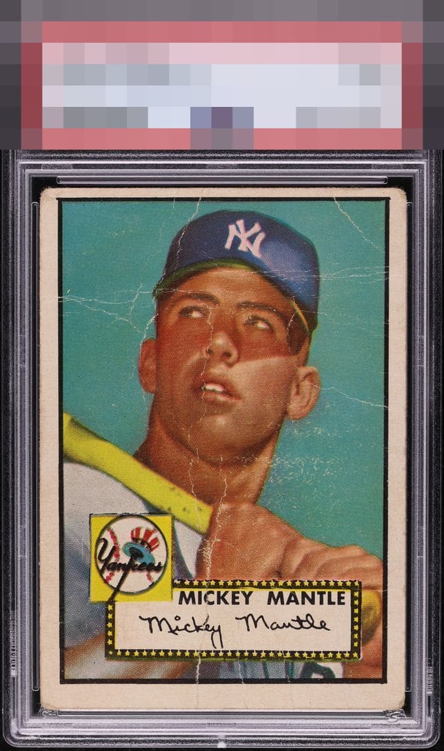
Significant creasing throughout the face greatly detracts from the eye appeal for me. Still has nice color though.

nice and bright. The color is fading but still strong. The image is also good. There is speckling and spiderwebs but it is not a visual distraction. Nice bold borders and slightly off center(especially top to bottom)
5 reviews
2 reviews
EyeQ+
--
Global Population
141
POPULATION ACROSS ALL GRADES AND GRADING COMPANIES
Global Eye Rank
—
No Eye Q+ score
Population in Grade
76
POPULATION IN THIS GRADE ACROSS ALL GRADING COMPANIES
Eye Rank in Grade
—
No Eye Q+ score
EYEQ+ TROPHY CASE

GLOBAL

IN-GRADE
Trophies appear here when earned.
📊
Rating Distribution
7 total reviews
G
0%
A+
0%
A
0%
A-
0%
B+
0%
B
1 rating
20%
1
B-
0%
C+
0%
C
0%
C-
1 rating
20%
1
D+
1 rating
20%
1
D
2 ratings
40%
2
D-
0%
F
0%
The centering is pretty extreme toward the top and lots of veins that run through his face.