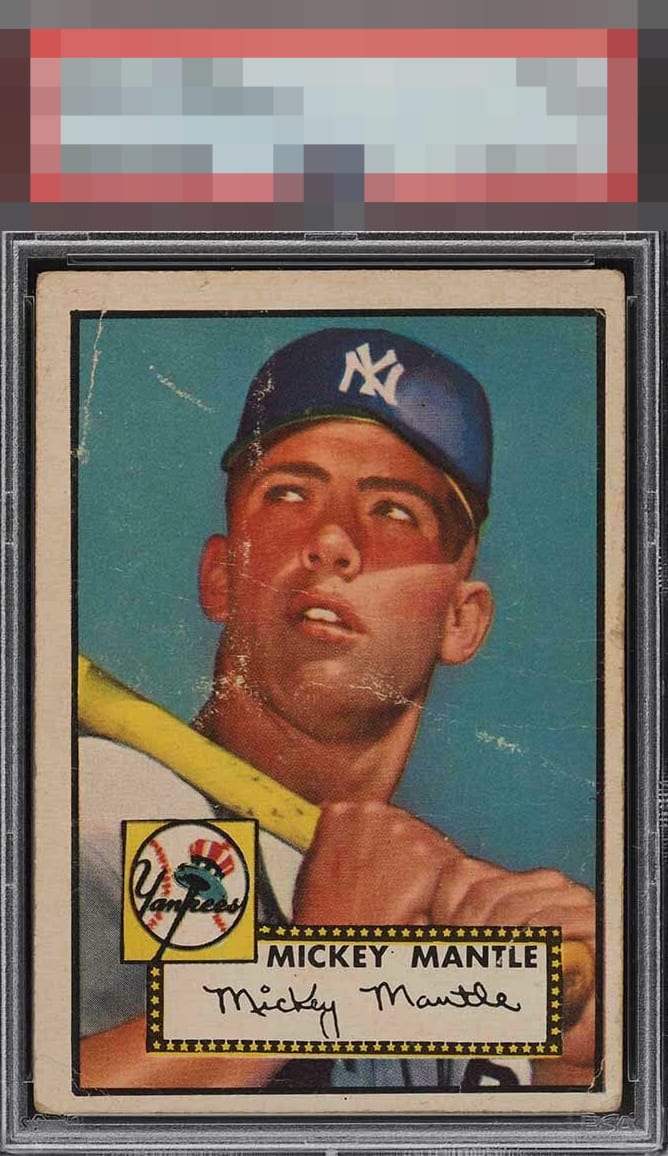
1952 Topps Mickey Mantle #311
1 / 2
💬
Reviews & Discussions
13 total reviews

I concur with the TPG on this one. The blue coloring is sharp.


The wrinkles definitely detract from the eye appeal, but the image and colors are still good. And the centering isn't terrible.

Not ideal. Centering is too far off combined with plenty of other defects

Unfortunate, yet the centering and the heavy scarring bring it down. It's an interesting card, because if not for those scars in such a tragic place, the other areas of the surface are rather nice.


The colors are still strong and the image is good. Just to many white lines and speckles for the eye to enjoy.
10 reviews
3 reviews
EyeQ+
111.0
Global Population
141
POPULATION ACROSS ALL GRADES AND GRADING COMPANIES
Global Eye Rank
#26
Population in Grade
76
POPULATION IN THIS GRADE ACROSS ALL GRADING COMPANIES
Eye Rank in Grade
#12
EYEQ+ TROPHY CASE

GLOBAL

IN-GRADE
📊
Rating Distribution
13 total reviews
G
0%
A+
0%
A
0%
A-
0%
B+
0%
B
0%
B-
1 rating
10%
1
C+
0%
C
2 ratings
20%
2
C-
1 rating
10%
1
D+
2 ratings
20%
2
D
2 ratings
20%
2
D-
1 rating
10%
1
F
1 rating
10%
1
Nope. Centering and surface issues are major detractions. This copy was bombarded by asymmetry.