1952 Topps Mickey Mantle #311
1 / 2
💬
Reviews & Discussions
8 total reviews


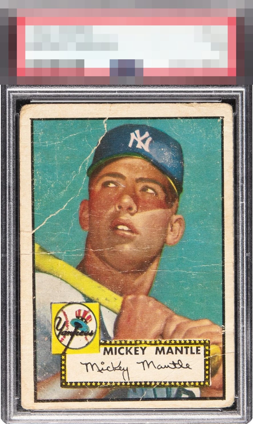
Basically what a 1 should look like. A tad better because the face is almost unscathed.


all those creases and major issues on the corners. The colors are faded

Tilt, poor centering, and severe wrinkles make this an accurately graded 1 that delivers eye appeal commensurate with that grade. This is what a 1 is supposed to look like. Just a worn and loved card that survived time.
6 reviews
2 reviews
EyeQ+
--
Global Population
141
POPULATION ACROSS ALL GRADES AND GRADING COMPANIES
Global Eye Rank
—
No Eye Q+ score
Population in Grade
76
POPULATION IN THIS GRADE ACROSS ALL GRADING COMPANIES
Eye Rank in Grade
—
No Eye Q+ score
EYEQ+ TROPHY CASE

GLOBAL

IN-GRADE
Trophies appear here when earned.
📊
Rating Distribution
8 total reviews
G
0%
A+
0%
A
0%
A-
0%
B+
0%
B
0%
B-
0%
C+
0%
C
0%
C-
1 rating
17%
1
D+
2 ratings
33%
2
D
2 ratings
33%
2
D-
0%
F
1 rating
17%
1
Great for someone that wants to own a copy of this iconic card but too many creases and surface issues for me. Centering is also off.