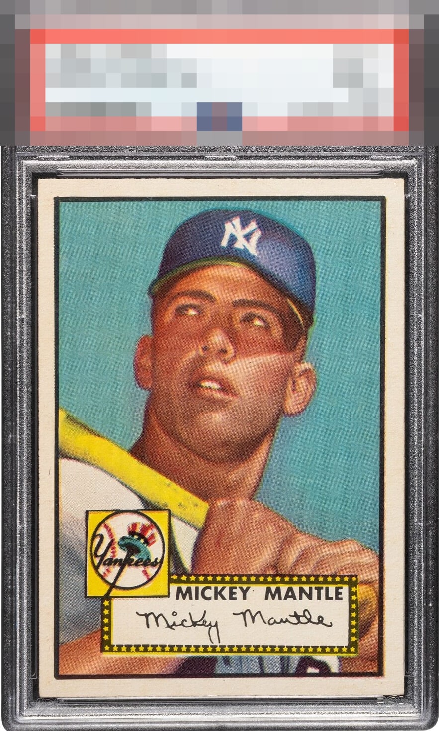
1952 Topps Mickey Mantle #311
Reviews & Discussions
12 total reviews

If you look at the cap, the image is a little blurry on this one, along with centering that favors the left side pretty strongly. Good eye appeal. Just not top tier.

A touch off left to right, otherwise 100% GT status. INCREDIBLE copy.

I love the image, corners, centering is good enough. But for a 7.5 the card should have a deep blue background. This one is pale and annoying.

A nice high grade example but looks out of focus and left to right centering is off.


Great registration and eye appeal. But the left to right shift jumps at first look.

the 2nd Holy Grail behind Wagner T206. Wow great look and great image and colors. Borders look really nice. At this level loses it because of the centering.

This card is very, very mildly out of focus, and concedes some faint tilt favoring the bottom left. That said, it hits the eye well, better than most. Centering is the biggest issue to my eye.
EyeQ+
EYEQ+ TROPHY CASE


Rating Distribution
12 total reviews
I like the sharp corners and edges, yet the centering jumps out at me here and the registration is off in his hat. Those aspects keep it at a B+ to my eye.