1952 Topps Mickey Mantle #311
Reviews & Discussions
13 total reviews

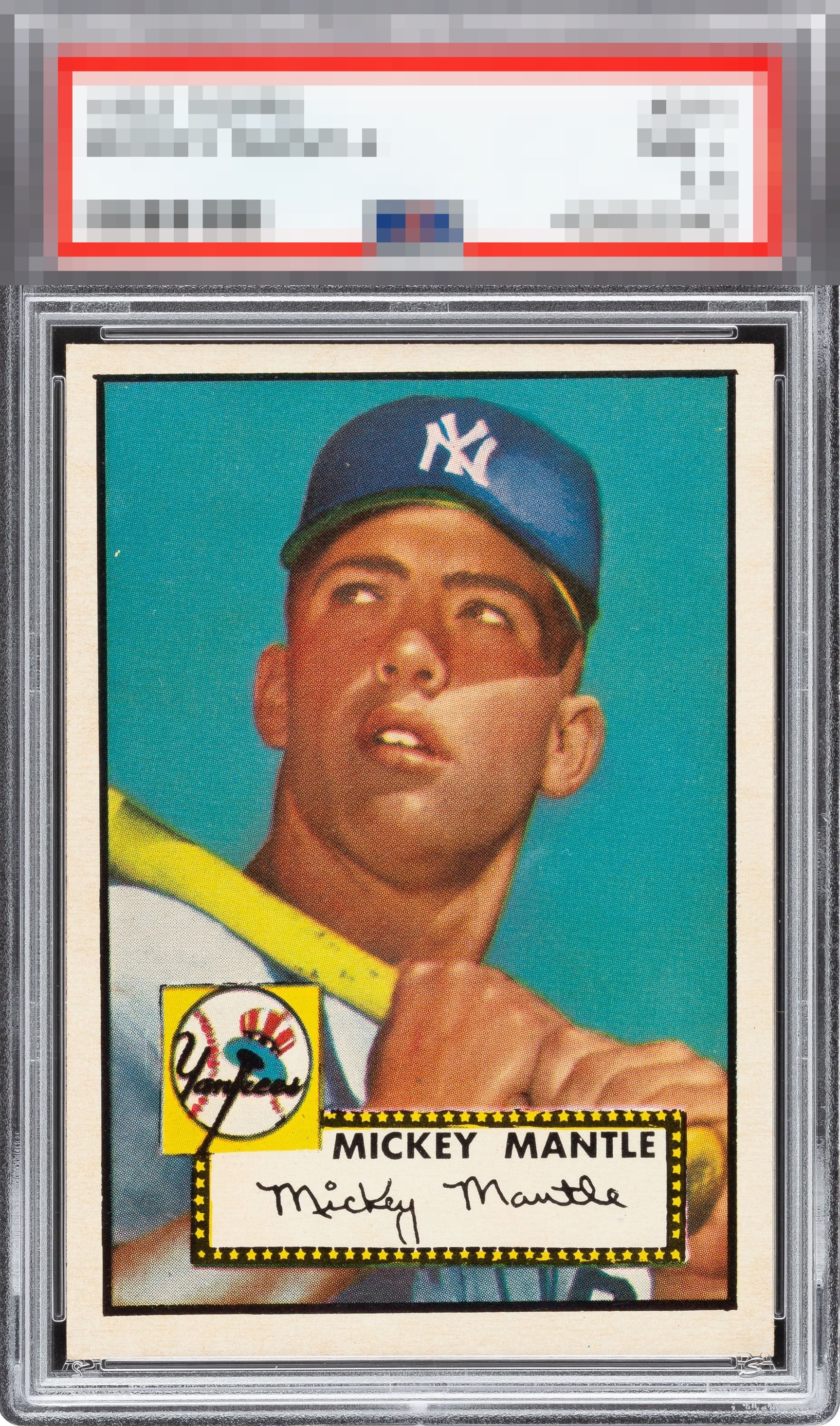
Given how strong the image and color appears, I would be willing to forgive the tilt and centering flaws. Really great example.


We could nitpick the top to bottom centering, but why? Incredible example. Huzzah to the owner of this grail!


Centering and tilt should be variables that weigh a lot more in the third party grading equation. In the realm of real live collectors choosing the cards they find best, centering and tilt are major factors. For lots of us, more than corners. In the case study of this card, centering and tilt should have brought it down in grade. Luckily here I can say they do indeed affect the eye appeal. This hits my eye as average despite the corners, precisely because the image is tilted and off-centered.

This copy shows very well for a 1952 Topps. The corners are remarkably sharp, and the print registration is crisp, giving the image a strong, clean look. The centering is better than most examples of this card, though a slight tilt and some off-centering keep it from being truly A tier. There is also some yellowing in the blue background and across the hands, which is noticeable but not overwhelming. Overall, it is a highly respectable example with strong visual appeal, worthy of a solid B-, and perhaps closer to an B in low lighting.


colors and image really POPs. off center on top and bottom. But great looking cards

As sharp as this card is, looking at that tilted centering every day would bother my eye and seek me to find a more evenly framed example for my collection.
EyeQ+
EYEQ+ TROPHY CASE


Rating Distribution
13 total reviews
Beautiful card. The slant is distracting and affects the grade, but the card has no other flaws.