1952 Topps Mickey Mantle #311
Reviews & Discussions
14 total reviews


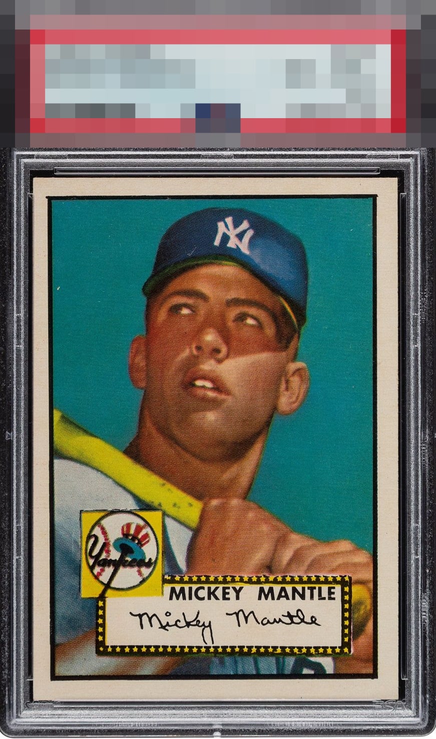
Centering keeps it from God tier. But how can you quibble with the grade?

Only held back by centering, which is still strong for the card.

We could nitpick the left to right centering, but why? Incredible example. Huzzah to the owner of this monster!

The tilt is severe, and centering is noticeably off. A nice example but I’m not seeing 8.5 eye appeal

There is just no way a card with this centering should be such a high grade. Eye Appeal wise, the tilt and centering make it a B to look at. I'd much prefer a dead centered 6 or 7 to this--and that is before we even consider this card with worse centering and tilt would likely cost MORE than the prettier example!

For a 1952 Topps, this copy impresses right away with corners that look almost defiant of its age—razor sharp and strikingly clean. The print registration holds up well, though the yellowing in the blue and across his hands and under the hat is more distracting than one would expect from an 8.5. Centering is another knock, as it drifts enough to undercut the overall eye appeal. Still, the card has undeniable presence, just not quite enough to earn top marks. A respectable and honest B.


The colors and the image POPS the corners look good and borders are clean. The off centering on this level of card is the grade difference

This is pedestrian centering for this card. The tilt makes it unattractive to my eye despite the sharp corners. In fact, this 3rd party grade seems both high and tantamount to a "corners only" grade. Were I shopping for this in the 60s or 70s and the cards were raw, I would pass this example right by without a thought due to the left white border being so much thinner than the right, at the top of the card. This card is a prime example of the 3rd party system being out of harmony with collector eyeballs, because while the difference to the naked eye in corners between this card and an 8 or 7.5's corners is negligible, at best, any naked eye can see tilt and off centering.
EyeQ+
EYEQ+ TROPHY CASE


Rating Distribution
14 total reviews