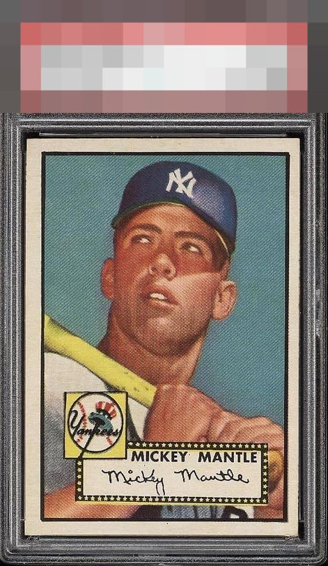
1952 Topps Mickey Mantle #311
1 / 2
💬
Reviews & Discussions
11 total reviews

Amazing card, obviously, but the color and centering could be better.

L to R centering is unfortunate here. The teal blue doesn't 'pop" like the GT examples. Very strong corners and a nice white border are noteworthy. Still a museum piece and a cornerstone for any collection.


Mantle's image looks great but the color doesn't pop and centering is off.


As the Eye appeal gets higher the centering is key to most people. There is the obvious shift from center but the over all card really is a WOW

SIde centering is the culprit here. Still, a strong eye appeal grade as the all important blue is unmarred and there is minimal detectable tilt-- which plagues so many examples of this iconic card.
10 reviews
1 review
EyeQ+
106.0
Global Population
141
POPULATION ACROSS ALL GRADES AND GRADING COMPANIES
Global Eye Rank
#35
Population in Grade
6
POPULATION IN THIS GRADE ACROSS ALL GRADING COMPANIES
Eye Rank in Grade
#3
EYEQ+ TROPHY CASE

GLOBAL

3rd Place
IN-GRADE
📊
Rating Distribution
11 total reviews
G
0%
A+
0%
A
1 rating
10%
1
A-
2 ratings
20%
2
B+
6 ratings
60%
6
B
0%
B-
1 rating
10%
1
C+
0%
C
0%
C-
0%
D+
0%
D
0%
D-
0%
F
0%
Centering kills the look of this card. Might just be the scan but the colour doesn’t pop either…