1952 Topps Mickey Mantle #311
Reviews & Discussions
15 total reviews

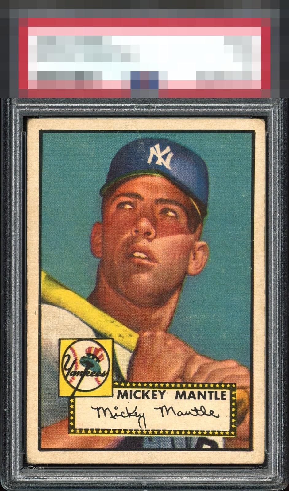
Amazing centering and strong color. Looks like a crease or streak through his cap and right eye add distraction.

No doubt one of the best 1's you will ever see. God tier eye appeal compared to grade. Touch below god tier due to the crease

Centering is great, color and registration too. The only thing holding it back is the crease running through his head.


To quote George Costanza, "I think it moved!". This card is phenomenal.

Unbelievable card. I wish the crease didn't cut through the lid and forehead - I really do - but despite that, it STILL warrants GT status. Impossible centering, vivid color, clean surface (front and back) and nice even corner wear means there's an extremely high chance that this is the most attractive "1" in existence. #want

The KING '1' of the '52 Topps Mantle. All hail this little guy who punches WAY above his weight!
EyeQ+

EYEQ+ TROPHY CASE


Rating Distribution
15 total reviews
Unbelievable 1! Amazing centering, color, and focus. Line across his face is the only distraction…but a small one.