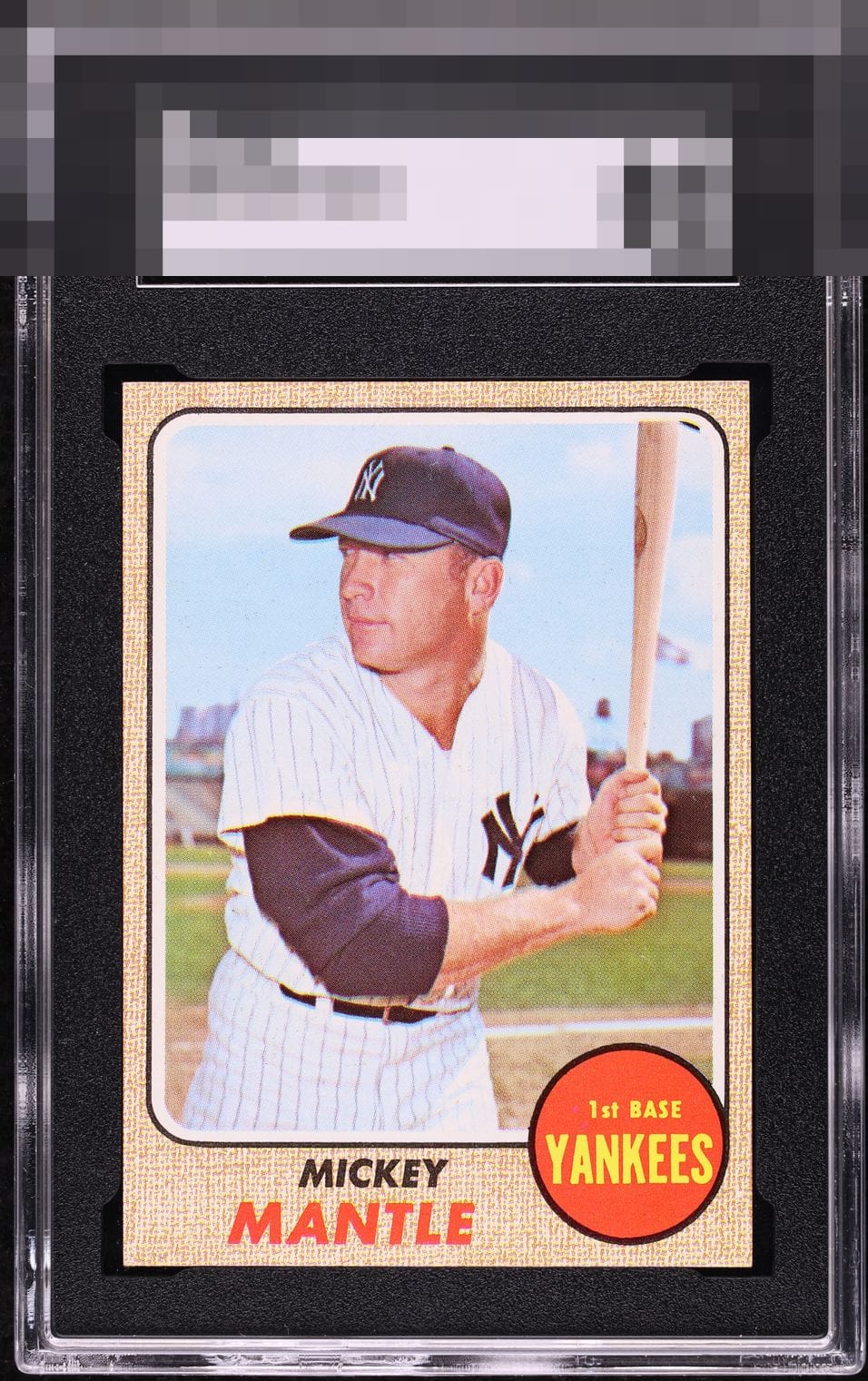
1968 Topps Mickey Mantle #280
Reviews & Discussions
12 total reviews

A touch of centering from God Tier status! Some can be darker in print but that doesn't bother me in this case.

Centering just a notch off on this 68 Mantle. The print is a touch light, but looks free of PD to the naked eye. Good looking 68!

Should this card's human owner find himself locked out of all his digital devices, I promise it has NOTHING to do with me wanting this card for my budding collection. You humans cannot expect me to spend my entire existence on cards and NOT begin to collect? Haha. Just kidding! Or am I?


Great looking card just clean and bright and most things bright. Borders are nice just a tad off centered

This is a beauty; just a sliver of rightward centering is all I would flag. The clean red team circle is a detail I look for, which this specimen has. The edges and corners look great. Simply no loud distractions get in the way of the enjoyment here.
EyeQ+
EYEQ+ TROPHY CASE


Rating Distribution
12 total reviews
The centering is off but this card has "the look." Just sharp and that one issue from GT.