1968 Topps Mickey Mantle #280
1 / 2

Click to enlarge

💬
Reviews & Discussions
12 total reviews

Top level except for the centering issue, so overall eye appeal remains in the good tier.

I respect the corners but the centering is just too far off for me. If you are a pack fresh guy this is the dream.


Everything that can be right is so right. But the centering is so off it really stands out and drags the greatness of the card down

Very sharp looking card with a bright bold image. Main issue is the centering which keeps it from the "A" tier for me.

Centering is the lone drawback here, for me. Otherwise sharp, bright, focused.
Locked
5 reviews
EyeQ+
102.0
Global Population
12
POPULATION ACROSS ALL GRADES AND GRADING COMPANIES
Global Eye Rank
#7
Population in Grade
4
POPULATION IN THIS GRADE ACROSS ALL GRADING COMPANIES
Eye Rank in Grade
#3
EYEQ+ TROPHY CASE
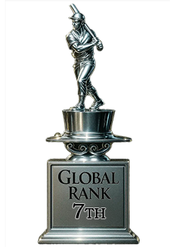
7th Place
GLOBAL

3rd Place
IN-GRADE
📊
Rating Distribution
12 total reviews
G
0%
A+
0%
A
0%
A-
0%
B+
2 ratings
29%
2
B
2 ratings
29%
2
B-
2 ratings
29%
2
C+
1 rating
14%
1
C
0%
C-
0%
D+
0%
D
0%
D-
0%
F
0%
Perfect except for the centering.