1951 Bowman Mickey Mantle #253

Reviews & Discussions
10 total reviews

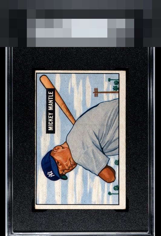
Several attractive features on the Mantle: face is relatively clear with good registration (hard to find on the 51 Bowman), sky and clouds feel fresh, and the nameplate is without blemish. Holding the card back are the roller line toward the middle which is common and the centering that is so near the top. Attractive example overall, the triangle of face to bat to nameplate can hold my attention


Obvious miscut & some staining but still a strong image, good color & right registration. Perfectly presentable lower grade copy.

The image looks great as does the color. Centering is the main issue.


This is a Wow card held back by the borders. The borders are to off center and mis-sized they do not frame the card well and looks odd as a result. The image and colors are solid but the card is held back by how the centering effects it to me

Normally I am much harsher on this level of centering, but the sharpess of Mick's image is very, very pleasing-- and I know this card deeply; it's a rare trait, that registration. The Mick nameplate is also clean. Any less than this registration and I would have to land in the lower bands.

Image of Mantle looks very focused. The colors look great and the black name bar appears to be blemish free. Badly off-centered T/B and there seems to be a vertical roller mark or stain in the middle of the card.

Image, focus, and color are great but centering holds it back for me.

EyeQ+
EYEQ+ TROPHY CASE


Rating Distribution
10 total reviews
What a unique case this one is. The centering is just so extreme it takes the eye appeal way down, for my taste. And that's unfortunate because the image is really great.