1951 Bowman Mickey Mantle #253
Reviews & Discussions
9 total reviews

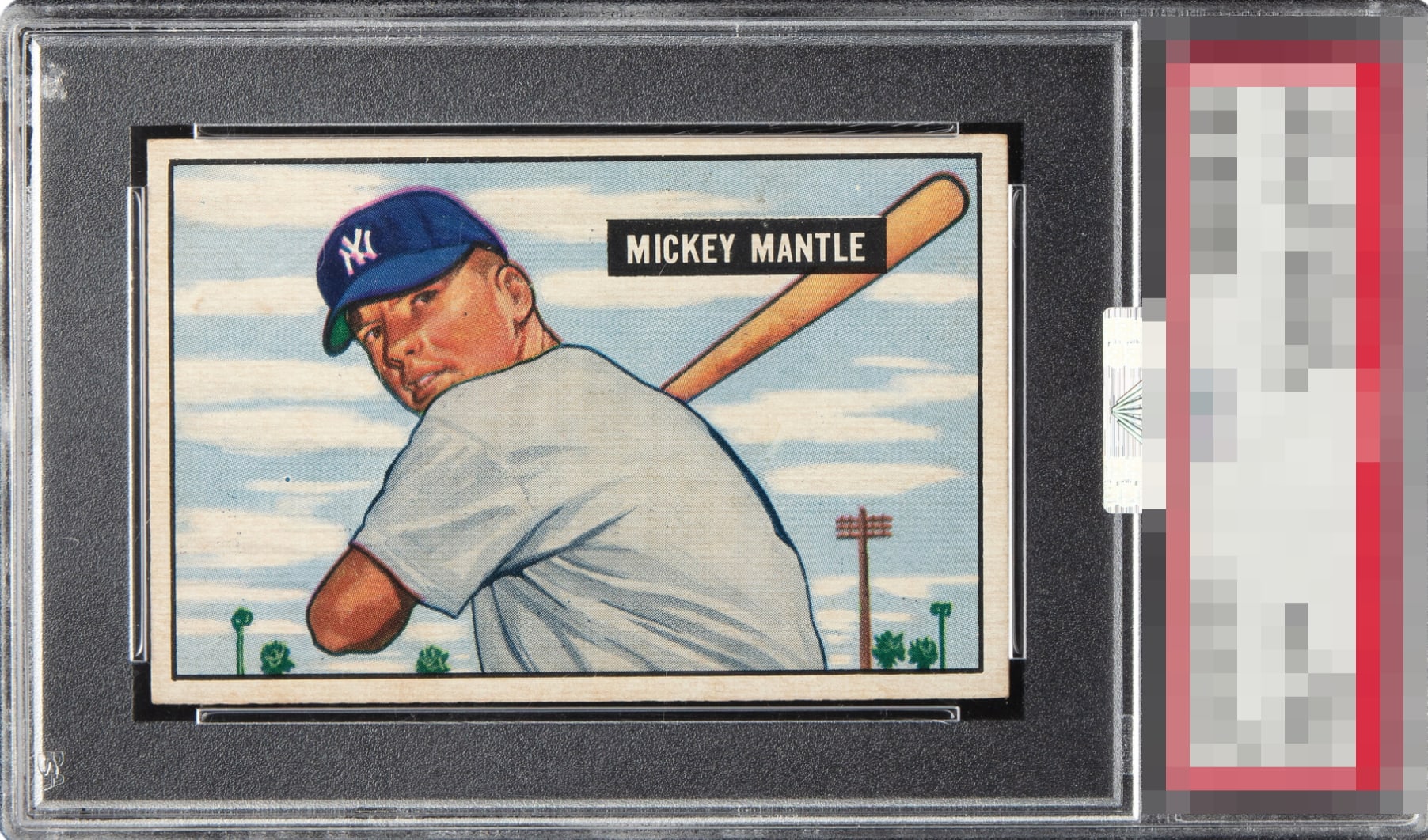
Certainly elite eye appeal for a card that almost always has a severe eye appeal flaw. Centering and registration are all that prevent higher eye appeal.

Fantastic example but just a bit off register, which is most evident around his cap. Nonetheless, a superlative copy of Mantle’s rookie.

This one has the poise of a serious centerpiece. The centering is excellent, the edges behave, and that black border gives the card a clean, authoritative frame. The name block is the real tell here, Mickey Mantle in black and white lands with sharp registration and it reads beautifully. The background stays steady too, which is half the battle on a card like this. The only smudge on the experience is the print being a touch off, and you’re right, it mostly shows on the hat. P.S. this is the correct kind of controversial. The 52 is the celebrity. This is the heirloom.

The registration on the cap is a touch off. Decently centered with a nice image.

Wish I could trade one of those corners for better centering and focus! But still very nice.

really like the overall look of the card and this is one of the better centered that I have seen. But the card has a tilt most noticeable in top right. THe colors and image is good but there is alot of surface wear/discoloring that distracts me to much. And something is off on the hat

One of my favorite cards, and in better shape than most. These are hard to find centered. This has decent centering, but still off both ways with some tilt. Registration is off and there are some surface issues above his name.

Strong overall. Nothing wrecks the eye appeal, but the cap has a bit of blur, which is noticeable using the compare feature. Centering is top tier yet still a bit off. If one of those two flaws was absent, this card would hit A/A+ for my taste.

EyeQ+
EYEQ+ TROPHY CASE


Rating Distribution
9 total reviews
Strong example with top end eye appeal. Centering and registration are obvious flaws though that affect eye appeal for me more than sharp corners help.