1951 Bowman Mickey Mantle #253
1 / 2
💬
Reviews & Discussions
4 total reviews


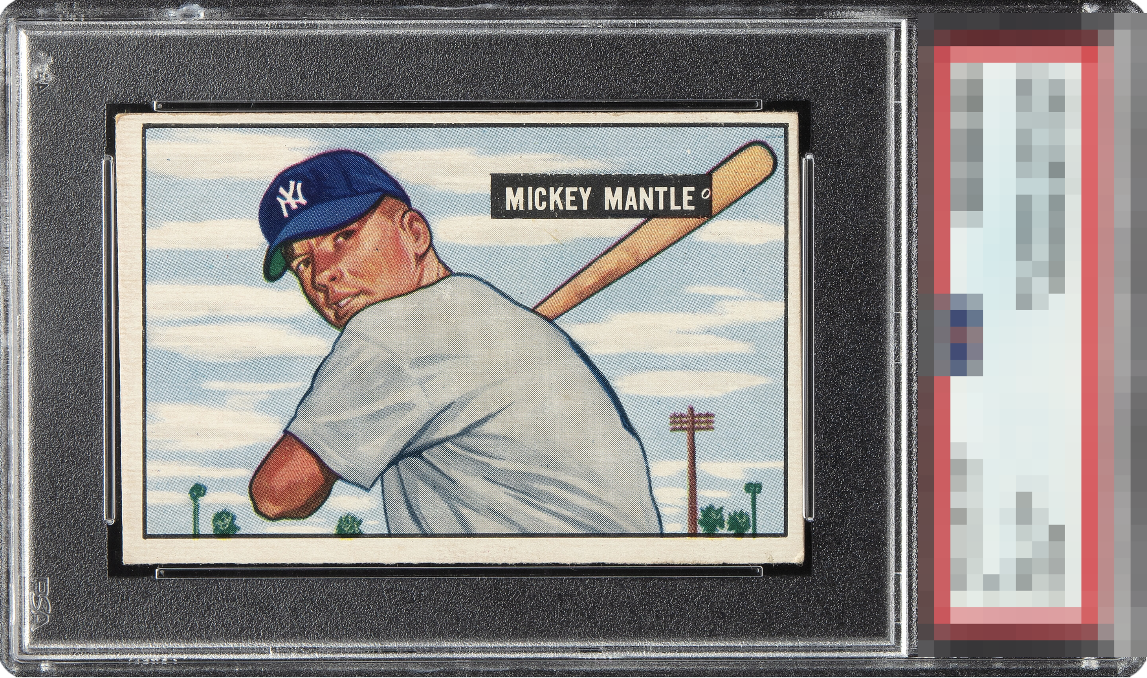
The Mick himself is so well focused; I always check the Yankee logo on the cap, and this one is crisp. But the centering is aggressive and that print dot in the name plate really holds my eye in the wrong way.

Extreme centering shift distracts my eye from an otherwise nicely registered example with bright colors.
4 reviews

0 reviews
EyeQ+
--
Global Population
48
POPULATION ACROSS ALL GRADES AND GRADING COMPANIES
Global Eye Rank
—
No Eye Q+ score
Population in Grade
6
POPULATION IN THIS GRADE ACROSS ALL GRADING COMPANIES
Eye Rank in Grade
—
No Eye Q+ score
EYEQ+ TROPHY CASE

GLOBAL

IN-GRADE
Trophies appear here when earned.
📊
Rating Distribution
4 total reviews
G
0%
A+
0%
A
0%
A-
0%
B+
0%
B
0%
B-
0%
C+
4 ratings
100%
4
C
0%
C-
0%
D+
0%
D
0%
D-
0%
F
0%
the card and image are relatively clean and the colors are solid and those are big pluses. But the centering of the borders are way off and the mis-sizing of them holds this card back