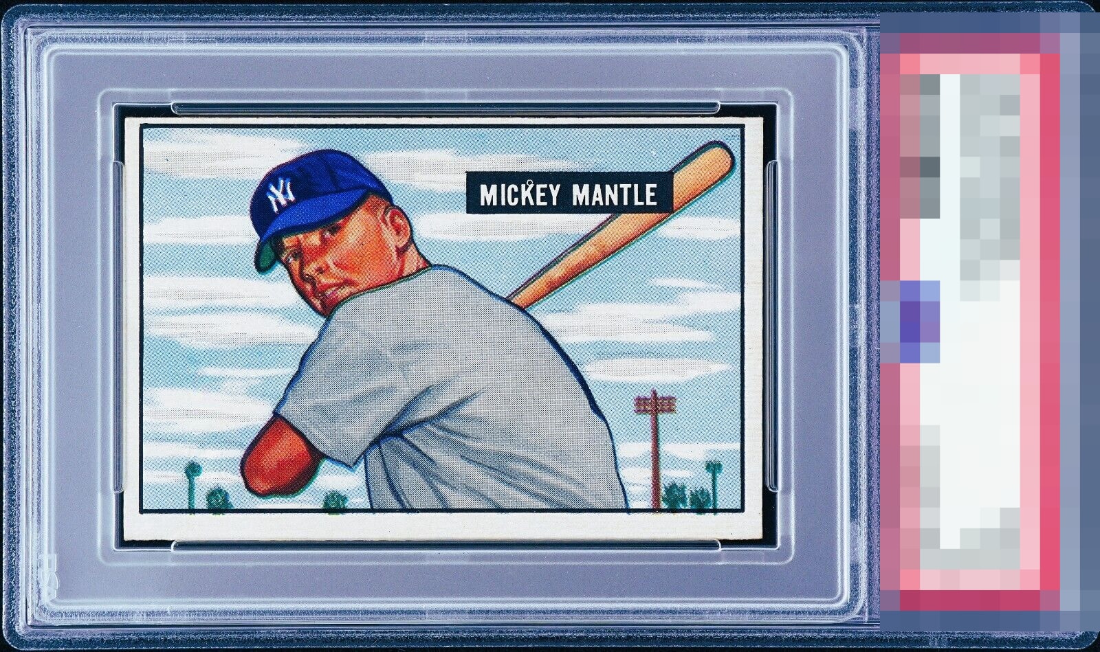
1951 Bowman Mickey Mantle #253
Reviews & Discussions
7 total reviews

Normally this centering would create a ceiling of a B-/C+ for my taste, and the PD in the nameplate is a no-no for my selection process. But with all that said, somehow the card still comes together enough to land a solid B.

I was going to be more harsh due to the centering but top bottom on a horizontal card isn’t a killer when the image and colors pop like this.

The colors really pop especially that clean blue cap. The issues are the T/B centering and the registration. Even though the colors are great, the registration really bothers me.

The image looks nice and the color and borders are bright. The top to bottom centering is too far off for me.

So so close. That top border holds the card down. The other three border are nice sized, the left right center is well enough but top bottom not so much The image and colors and brightness all strong

EyeQ+
EYEQ+ TROPHY CASE


Rating Distribution
7 total reviews
The centering shift is there, and it may be a little blurred, and there is a noticeable fish eye in the black box but it's Mick's rc and you are the very fortunate owner. Enjoy