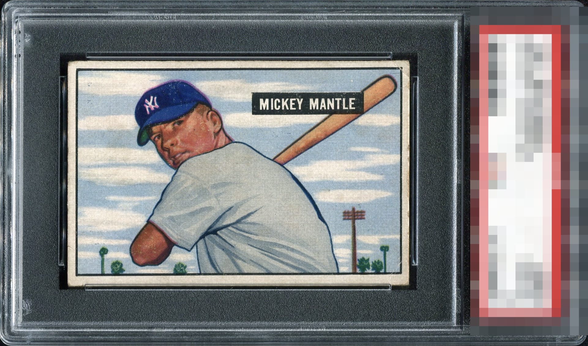
1951 Bowman Mickey Mantle #253

Reviews & Discussions
11 total reviews

Centering is A Tier. The edge and corner wear is NOT anything that bumps me. Registration and wear around his face affects the eye appeal a bit.

Great centering but there is some mottling around his face on the surface which is a rough location. The edge wear is not a flaw that factors in for my eye appeal assessment.

Nice card. Centering is just a touch off and there appear to be surface issues throughout, most notably what looks like some snow on the cap.

The surface wear around his face, and edge and corner wear on the right side are the main issues. Centering is better than most and keeps this just above C tier for me.

This card concedes overall wear but when totalled up it does not knock it out of the B Tier to me. The centering is above average, the cap has some blurriness, and the wear is confined mostly to the perimeter. Some soiling in the sky background is really the main eye appeal flaw for me.

centering is off but not dramatically but the borders are worn and discolored especially on the right side. The card has a nice image and colors but has a lot of noticeable staining Nice card to have an enjoy as long as you are ok with the limitations

Pretty nice card when you consider the centering which isn't always great on this card. The corners are frayed and the coloring is a bit stained. For a low grade example this is a nice one.

Better than average centering, but the tilt and surface wear distract my eyes along with the corner wrinkle. The registration is better than average and the overall package is nice to my eyes.

This card, despite its wear, pleases my eye. The centering is better than 90% of examples. The registration is admittedly a bit off. I notice the top right wear and wear in the cap. The bottom line is that when I relax back in this chair and take in the card, I think, "This is pretty, this works."
EyeQ+
EYEQ+ TROPHY CASE

Rating Distribution
11 total reviews
Surface issues at his cap and the right side of the card especially near the top are distracting. Very strong centering. Reverse highlights a crease going right through the middle of the card from right to left.